


Greetings from League Design Agency!
This is an automated smart form.
This is an automated smart form.
Would you like to receive cases related to your industry?
Fill in the data and receive a selection link via email within 5 minutes.
If you are looking for a job, select «Job candidate» in the «Your Goal» field.
* You can find the letter in the «Inbox» or «Promotions» folder
Fill in the data and receive a selection link via email within 5 minutes.
If you are looking for a job, select «Job candidate» in the «Your Goal» field.
* You can find the letter in the «Inbox» or «Promotions» folder

Portfolio
We believe that any good business has the right to look awesome. That's why we don't follow trends, but create timeless design, unique for each business and reflecting its essence. This helps your consumer or employee to understand whether they identify with you or not.
Muso.AI
World's first credit verification platform for music professionals.
Client
Function
Services
UX/UI design
United States
Location
Awards
The Very Best Of — Gold Award for Interface & User Expereience Design

Featured on Behance in category "Interaction Design"
Muso.AI
World's first credit verification platform for music professionals.
Client
Function
Services
UX/UI design
United States
Location
Awards
The Very Best Of — Gold Award for Interface & User Expereience Design
Featured on Behance in category "Interaction Design"
mobile screens
hours spent


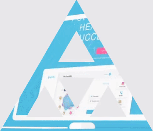
IDEA
Almost everything around us have its own rhythm (heart beating, breathing, day and night cycles, year seasons, even how objects placed in room). Rhythm is a basis of any musical composition, and this is what they all have in common. People are familiar with this, therefore they won't feel any discomfort or fakeness.
Muso app gives users ability to get information about not only popular artists but also beginners. App makes it easy to give credits to everyone who was involved in song creation process.
Muso app gives users ability to get information about not only popular artists but also beginners. App makes it easy to give credits to everyone who was involved in song creation process.
InList
The top mobile application for booking exclusive and curated parties, sporting events, concerts and once-in-a-lifetime experiences in jet-set cities around the world.
Client
Function
Services
Mobile App
USA
Location
Awards
The Very Best Of - Silver Award for UI/UX
InList
Client
Function
Services
Mobile App
Location
The top mobile application for booking exclusive and curated parties, sporting events, concerts and once-in-a-lifetime experiences in jet-set cities around the world.
United States
The Very Best Of - Silver Award for UI/UX
Awards
app screens
hours


IDEA
We had to redesign an app to reveal new positioning of the brand as an all-in-one service for booking great impressions. We have transformed a regular night parties booking app into worldwide all-in-one booking application for all day events with expressive design system. Rate the event, chat with support, get direction to event and quickly check avaliable dates for booking. InList support works 24/7 to provide best service.
The Very Best Of - Silver Award for APPS Design
Powerbuilding
With this app the user can get all the guidance he requires and reach his sports aims.
Client
Function
Services
Brand Identity
New York, USA
Location
Awards
Mobile App
The Very Best Of -
Silver Award for APPS Design
Silver Award for APPS Design
Powerbuilding
With this app the user can get all the guidance he requires and reach his sports aims.
Client
Function
Services
Brand Identity
New York, USA
Location
Awards
Mobile App
app screens
hours
types of carries


IDEA
Powerbuilding is a hugely comprehensive mobile app. It has three important categories: Health, Nutrition and Training. Each category has a separate dashboard.
The Powerbuilding app creates an individual training program and weekly menu depending on the aims and personal body characteristics. Moreover, the Powerbuilding app keeps all the information about the user's current state of health. The app allows him to sign up for the necessary laboratory tests and receive his test results at the same place.
Powerbuilding brand identity is inspired by scientific labs. It became a metaphor for the identity system as the aesthetics of a real laboratory can be compared to the secret superhero lab.
Synergy
Connect dental clinics with dentists across the country to conduct complex operations together. Providing more complex services to clients of clinics.
Client
Function
Services
Brand identity
Marketing website
Web-app design
United States
Location
Awards
The Very Best Of — Silver Award for Digital Performs & Websites Design


pages and mobile screens
types of brand carries
hours spent
IDEA
The metaphor of the "Airport" project is expressed in graphics using the aesthetics of navigation, paths and destinations. It is embodied in simple and catchy forms, which forms 100% differentiation from the market.
HumanCode
Physiognomy is a practice of assessing a person's character from their outer appearance — especially the face. Using machine learning and based on this science, the product clarifies the features of character and behavior of the user.
Client
Function
Services
Brand platform
Visual identity
Mobile App
Israel
Location
Awards
Featured on Behance in category "Interaction Design"


app screens
printing carriers
hours spent
IDEA
Explaining behavior through science is an attempt to trap a "soul in a test tube." The interface is futuristic, to demonstrate manufacturability. And the dominant is a bunch of fog, symbolizing the elusive soul.
Tarilka
The Ukrainian Institute of scientific and technical expertise and information building
Client
Function
Services
Brand Identity
Kyiv, Ukraine
Location
Awards
Featured on Behance in category "Best of Behance"
The competition "Power of Young 2020" - 3rd place in the category "Visual"
Tarilka
The Ukrainian Institute of scientific and technical expertise and information building
Client
Function
Services
Brand Identity
Kyiv, Ukraine
Location
Awards
Featured on Behance in category "Best of Behance"
The competition "Power of Young 2020" - 3rd place in the category "Visual"
IDEA
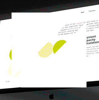
Visual communication is built around the plan of its architectural renovation created by the group of activists from the SaveKyivModernism organization. According to the plan, Tarilka may become a modern cultural platform with an exhibition hall, a music hall, and cafes.
CXDOJO
Create a unique corporate identity for a company providing IT-consulting services with a full development cycle and consultations in the field of custom experience.
Client
Function
Services
Website
Visual identity
United States
Ukraine
Location
Awards
The Very Best Of — Silver Award for Branding
CXDOJO
Create a unique corporate identity for a company providing IT-consulting services with a full development cycle and consultations in the field of custom experience.
Client
Function
Services
Website
Visual identity
United States
Location
Awards
The Very Best Of — Silver Award for Branding
Ukraine


types of brand carries
website pages
hours spent
IDEA
The name consists of two words CX and DOJO. CX — explains the industry, and DOJO — proximity to the Japanese product approach in development. We looked for something common in concepts and found it — it is the way. The user's path through the product and the path to continuous product improvement.
Featured on Behance in category "Adobe Stock"
The Very Best Of — Gold Award for Web Design
Featured on Behance in category "Interaction Design"
OU Israel
To give Orthodox Jews who have just moved to Israel from other countries access to everything that the local community offers them: places, events, programs, community.
Client
Function
Services
Website
Israel
Location
Awards
Featured on Behance in category "Interaction Design"
Featured on Behance in category "Adobe Stock"
The Very Best Of — Gold Award for Web Design
OU Israel
To give Orthodox Jews who have just moved to Israel from other countries access to everything that the local community offers them: places, events, programs, community.
Client
Function
Services
Website
Israel
Location
Awards


website pages
hours
IDEA
The idea of graphics conveys what Jewish believers are most emotionally connected to — the synagogue. Traditional forms, canons and symbols are presented in simple forms and served in a modern context.
Technology startup with an ambitious mission to create the future.
Client
Function
Services
Website
Visual identity
Kyiv, Ukraine
Location
Geo Protocol
Geo Protocol
Technology startup with an ambitious mission to create the future.
Client
Function
Services
Website
Visual identity
Kyiv, Ukraine
Location
April 2019
Date


types of brand carries
website pages
hours spent
IDEA
The technical protocol is designed to allow people to exchange any values in real time. Euro is for cryptocurrency, cryptocurrency is for real estate, and so with any other assets. The technology is based on blockchain and can be used by other projects to spread the free values exchange idea.
Kritika
Service for checking code, searching for errors and vulnerabilities
Client
Function
Services
Brand platform
Visual identity
Estonia
Location
Awards
Featured on Behance in category "Adobe Stock"
Featured on Behance in category "Graphic Design"
The Very Best Of — Silver Award for Branding
Kritika
Service for checking code, searching for errors and vulnerabilities
Client
Function
Services
Brand platform
Visual identity
Estonia
Location
Awards
Featured on Behance in category "Adobe Stock"
Featured on Behance in category "Graphic Design"
The Very Best Of — Silver Award for Branding


types of carriers
pages of guideline
hours spent
IDEA
The identity is built around the most recognizable symbol of the detected error — the red underlined text. A company graphic emphasize the idea of showing metaphors of machine enumeration of data or automatic search.
Barfli
Service
Client
Function
Services
Mobile App
USA
Location
Barfli
Service
Client
Function
Services
Mobile App
USA
Location
app screens
hours


IDEA
We got a request to design a mobile application for seamless orders in bars. The core idea was to provide the possibility of queue-free orders to make post-lockdown nightlife safer. Along the way, to save guests' time for communication and make bartenders' work more efficient.
The app will be integrated into the infrastructure with an admin page and bar POS (point of sales) systems. Integration into the existing POS system is the optimal solution for the easy start because it affects bars processes minimally.
The app will be integrated into the infrastructure with an admin page and bar POS (point of sales) systems. Integration into the existing POS system is the optimal solution for the easy start because it affects bars processes minimally.
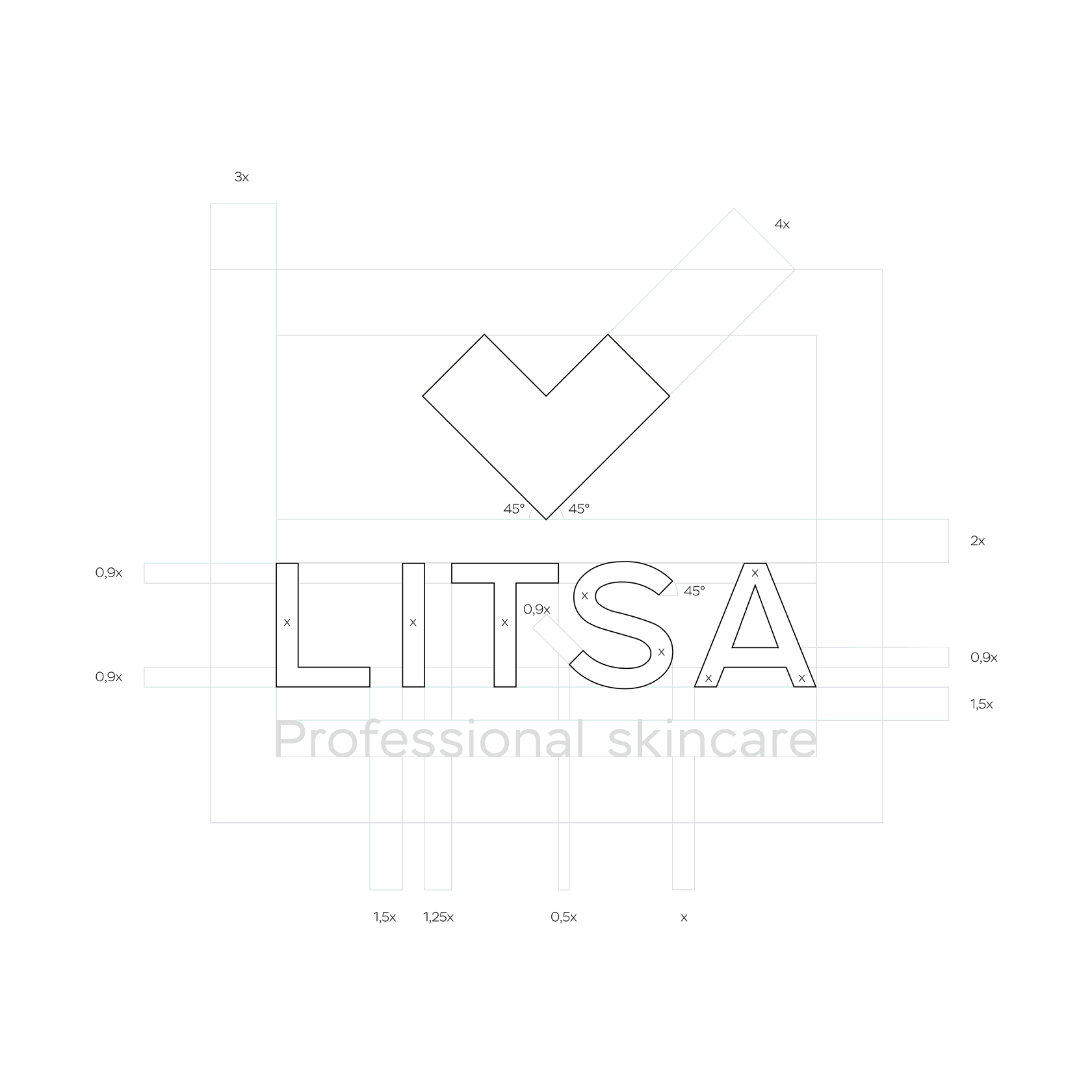
Litsa
A cosmological clinic focused on facial skin care using modern medical technologies.
Client
Function
Services
Brand platform
Visual identity
Packaging design
Communication
Ukraine
Location
Awards
Featured on Behance in category "Graphic Design"
Featured on Behance in category "Adobe Illustrator"
Publication on the book "Color your package"


types of carriers
hours spent
IDEA
The heart, a symbol of care, is filed in a medical context and mirrored in a branding. So to demonstrate the properties of a cosmetic procedure or preparation: a cross — heals, a shield — protects, an arrow nourishes. The logo forms are also reflected in the packaging forms for maximum synergy.

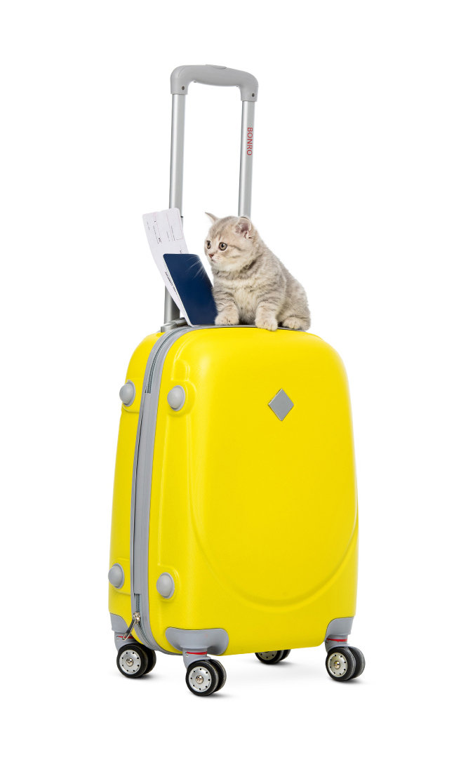
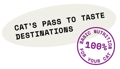
Whiskas
Rebranding and packaging design concept for cat food brand
Client
Task
Services
Brand platform
Visual identity
Packaging design
Communication
US & Europe markets
Location
Awards
The Very Best Of — Silver Award for Branding
Whiskas
Rebranding and packaging design concept for cat food brand
Client
Task
Services
Brand platform
Visual identity
Packaging design
Communication
US & Europe markets
Location
Awards
The Very Best Of — Silver Award for Branding


posters
types of packaging
hours spent
IDEA
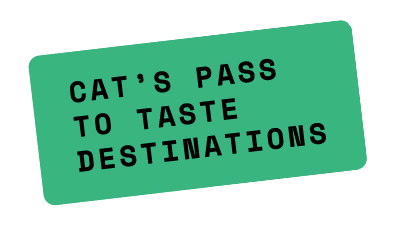
The main idea is a taste journey. The new line of Whiskas nutrition is a gastro tour for cats. It’s about discovery and curiosity. The idea finds its extension in the new slogan — "Cat's pass to taste destinations". The visual language was inspired by the visa stamps.
Ignilife
To accustom company employees to a healthier lifestyle, and thus reduce the annual cost of life and health insurance.
Client
Function
Services
Mobile App
Web site
Visual identity
France
Location
Awards
Featured on Behance in category "Interaction Design"
Ignilife
Client
Function
Services
Mobile App
Web site
Visual identity
France
Location
To accustom company employees to a healthier lifestyle, and thus reduce the annual cost of life and health insurance.
Awards
Featured on Behance in category "Interaction Design"
website pages


app screens
hours spent

IDEA
We can only control what we can measure." The product takes measurements of biometric data, conducts questionnaires and shows personal data in comparison with the national average. And for active motivation, the application offers daily, weekly and monthly challenges to get rid of bad habits and acquire healthy ones.
OMG
Launch of a new brand of lactose-free cream on the market.
Client
Function
Services
United States
Location
Awards
The Very Best Of — Best of Concept Design
Research and positioning
Visual identity
OMG
Launch of a new brand of lactose-free cream on the market.
Client
Function
Services
Visual identity
Research and positioning
United States
Location
Awards
The Very Best Of — Best of Concept Design


types of packaging
hours spent
IDEA
Create the feeling of a Guilt-free product that brings a long-awaited holiday to its customer.
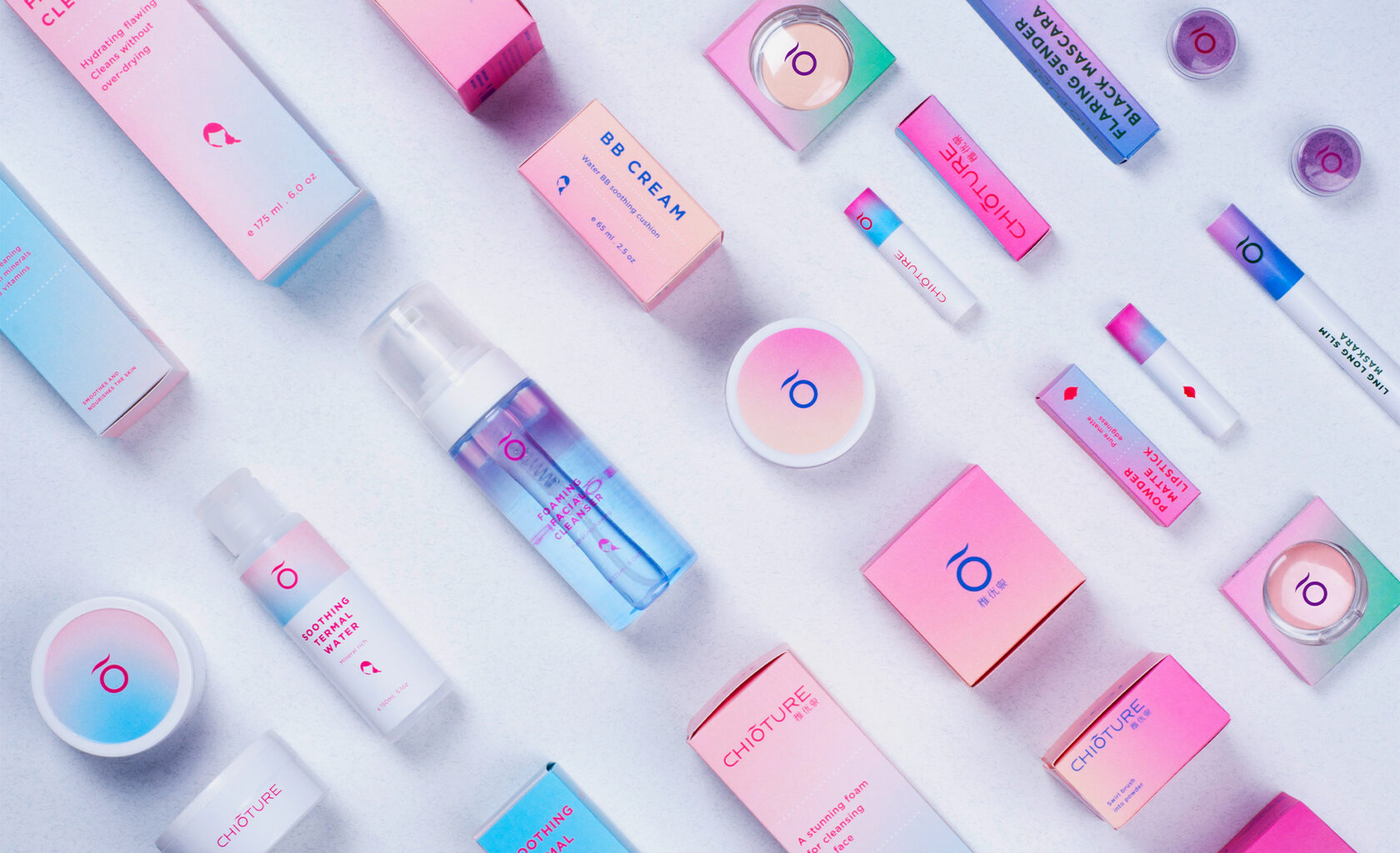
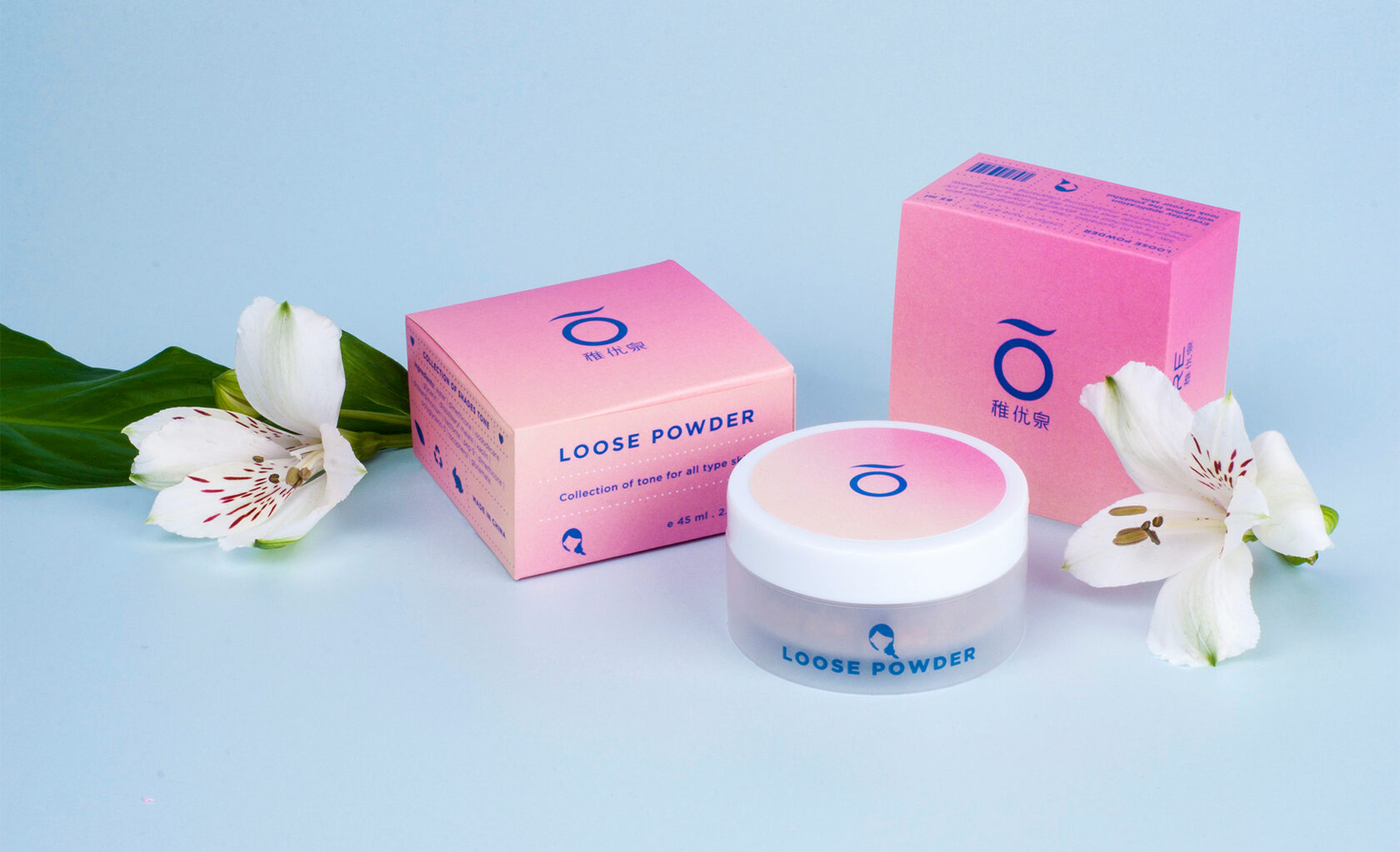
Chioture
Cosmetics
Client
Function
Services
Visual Identity
China
Location
Awards
The Very Best Of - Silver Award for Branding
Featured on Behance: "Adobe Indesign".
Packing design
Chioture
With this app the user can get all the guidance he requires and reach his sports aims.
Client
Function
Services
Visual Identity
New York, USA
Location
Awards
The Very Best Of — Silver Award for Branding
Featured on Behance: "Adobe Indesign".
Packing design
hours
types of carries


IDEA
Chioture is Chinese brand of decorative cosmetics. It is distributed mostly in the local market and worldwide through Aliexpress and Taobao Mall.
Our task was to define the identity system and single standard of packaging, due to which brand image could be unified. Also we had to make a brand representation appropriate to its target audience.
Color system of the brand consists of sunrise, blossoming and pastel-sweet shades. It provides a full plunge into the atmosphere of carefree youth. For new CHIOTURE's image we've chosen neutral sans serif font that balances the bright energy of graphics.
Blip
Unite neighbors for joint activities near the house:
Sports, social, entertainment
Sports, social, entertainment
Client
Function
Services
Website
Belgium
Location
Awards
Featured on Behance in category "Adobe XD"
Featured on Behance in category "Interaction Design"
The Very Best Of — Gold Award for Web Design
Blip
Unite neighbors for joint activities near the house:
Sports, social, entertainment
Sports, social, entertainment
Client
Function
Services
Website
Belgium
Location
Awards
Featured on Behance in category "Adobe XD"
The Very Best Of — Gold Award for Web Design
Featured on Behance in category "Interaction Design"
Visual identity
Web design


desktop screens

mobile screens
illustrations
IDEA
Blip is an initiative portal where you can follow various open project, chat with your friends, write comments, and participate in any event.
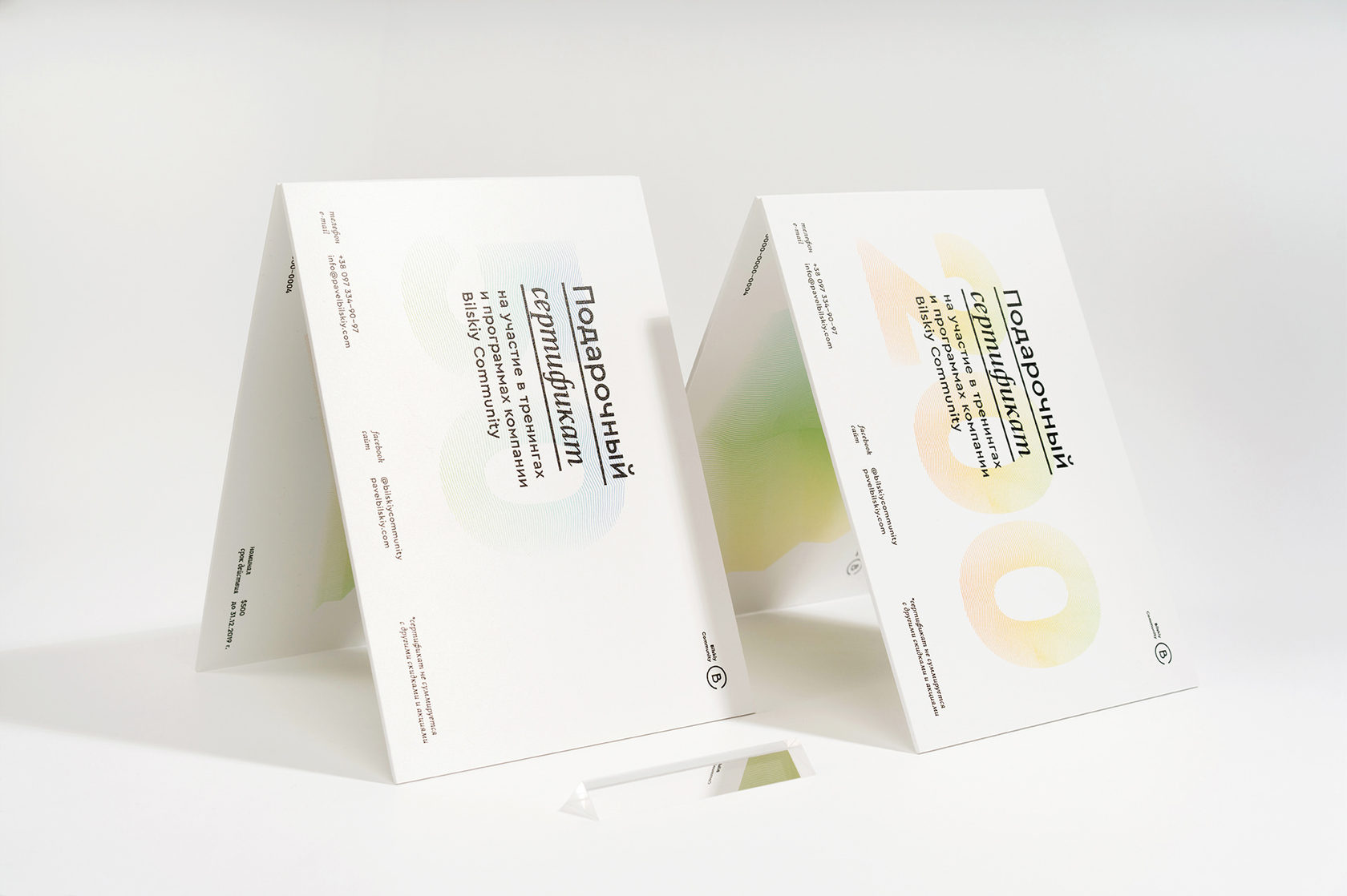
Bilskiy Community
Educational courses on personal growth and coaching
Client
Function
Services
Brand platform
Kyiv, Ukraine
Location
Web design
Visual identity
Bilskiy Community
Educational courses on personal growth and coaching
Client
Function
Services
Brand platform
Kyiv, Ukraine
Location
Visual identity
Web design
IDEA
In order to create a holistic image in the identity, we use a metaphor. It helps to connect corporate identity with the real world. The result is a clear and easy to visualize image that conveys the character, idea and motive of the brand.
Get a Design Consultation
Tell us everything
Poland
Ukraine
Katowice,
Armii Krajowej St., 322
Armii Krajowej St., 322
Kyiv,
Goncharnaya St., 9a
Goncharnaya St., 9a
Call Us
Call Us

USA
New York,
287 Park Avenue South
287 Park Avenue South
Call Us
E-mail

Tell us everything


