


WHISKAS BRAND
Services
Task
Location
Client
Brand platform
Visual identity
Packaging design
Communication
Visual identity
Packaging design
Communication
Rebranding and pack-aging design concept for cat food brand
US & Europe markets
Date
January 2019
Whiskas is a well-known mass-market manufacturer of cat food.
This is a strong brand with 80 years history.
The task was to attract an audience with an above average income, avid cat owners, who want something special for their pets. It was also necessary to refresh the design, make it more clean and modern, work out the positioning and communication for Europe and US markets.
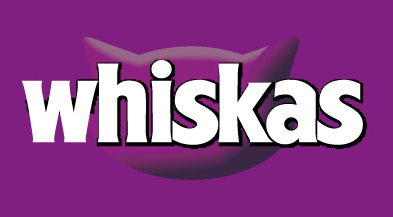
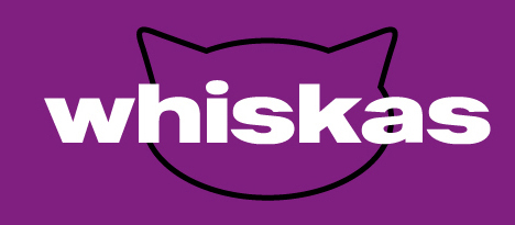
LOGO
We've analyzed the current communication and design of the Whiskas brand, the market and competitors. As a result, we preserved the corporate color and slightly refreshed the logo, making it more modern.
BEFORE
AFTER
IDEA
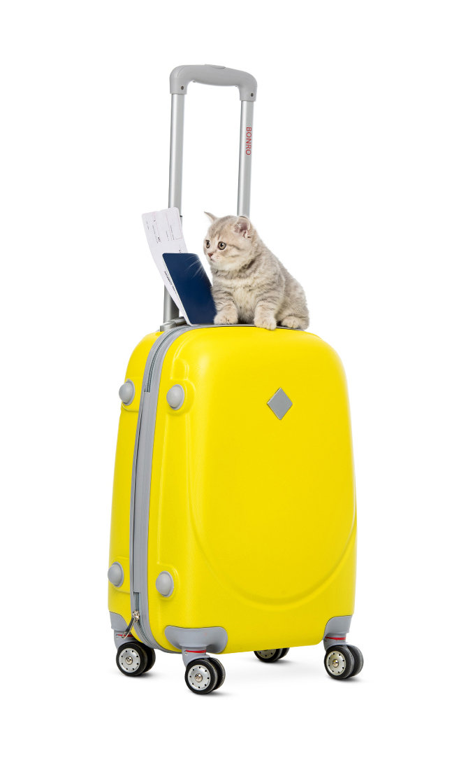
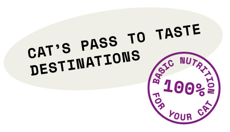
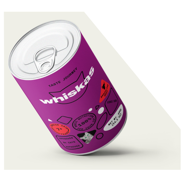
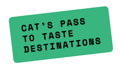
The main idea is a taste journey. The new line of Whiskas nutrition is a gastro tour for cats. It's about discovery and curiosity. The idea finds its extension in the new slogan — "Cat's pass to taste destinations". The visual language was inspired by the visa stamps.
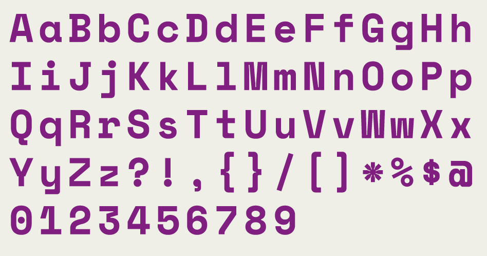
FONT
The letterforms of the monospaced typeface have a visual reference to typewriters aesthetics and flight tickets, which complements the main idea.

COLOR
We kept the recognizable brand color as the main for packaging.
HEX #941f80
CMYK 50 100 3 0
Pantone 2415 C
CMYK 50 100 3 0
Pantone 2415 C
HEX #efefe6
CMYK 8 5 11 0
Pantone 7604 C
CMYK 8 5 11 0
Pantone 7604 C
HEX #ff2e3f
CMYK 0 89 66 0
Pantone 1788 C
CMYK 0 89 66 0
Pantone 1788 C
HEX #31c8f7
CMYK 66 0 0 0
Pantone 298 C
CMYK 66 0 0 0
Pantone 298 C
HEX #39c994
CMYK 67 0 55 0
Pantone 7465 C
CMYK 67 0 55 0
Pantone 7465 C
HEX #f6931b
CMYK 0 50 92
Pantone 151 C
CMYK 0 50 92
Pantone 151 C
HEX #f4ec4f
CMYK 10 0 76 0
Pantone 101 C
CMYK 10 0 76 0
Pantone 101 C
Taste lines are differentiated by the original color coding of design elements.

PACKAGING
New Whiskas nutrition line is called Taste Journey. The idea of gastro tour for cats finds it extension in packaging design. Small geometric shapes are simplified of cat food pieces.
COMMUNICATION
The important part of this project is communication. We've created two campaigns in different visual directions within one identity style.
One campaign is for promotion of the new packaging line. Another tells small stories on behalf of cats and builds a semantic bridge between the idea of gastro tour and diversity of cats and tastes.
One campaign is for promotion of the new packaging line. Another tells small stories on behalf of cats and builds a semantic bridge between the idea of gastro tour and diversity of cats and tastes.
Art Direction
Alexandr Gusakov
Graphic Design
Katerina Korolevtseva
CREDITS
Copywriting
Katerina Korolevtseva

Get a Design Consultation
Tell us everything
Poland
Ukraine
Katowice,
Armii Krajowej St., 322
Armii Krajowej St., 322
Kyiv,
Goncharnaya St., 9a
Goncharnaya St., 9a
Call Us
Call Us


USA
New York,
287 Park Avenue South
287 Park Avenue South
Call Us
E-mail

Tell us everything


