Greetings from League Design Agency!
This is an automated smart form.
This is an automated smart form.
Would you like to receive cases related to your industry?
Fill in the data and receive a selection link via email within 5 minutes.
If you are looking for a job, select «Job candidate» in the «Your Goal» field.
* You can find the letter in the «Inbox» or «Promotions» folder
Fill in the data and receive a selection link via email within 5 minutes.
If you are looking for a job, select «Job candidate» in the «Your Goal» field.
* You can find the letter in the «Inbox» or «Promotions» folder
Essential Digital Design
We create kick-ass products.
Key: awesome user experience
and captivating visual aesthetics.
Key: awesome user experience
and captivating visual aesthetics.
Let's be real. We will create the ideal user experience only after a number of experiments and improvements. However, we can get rid of mistakes made before you and some of yours as well, making your life after the product's launch that much easier.
Our vision
Discovery
Some start design projects by sitting down and plunging into drawing – it's not about us. We start by getting ready for the design stage and making sure we understand everything about the project, from our client's essence to the project's goal.
Brief
8 - 12 hours
We start with a series of questions and answers. After this, our creative group (designer, art director and project manager) discuss everything in detail. The goal cannot be to just shoot in the air and hope for the best. That's why we want to understand the task in full detail. We want to know all the answers, no blank spaces can be left.

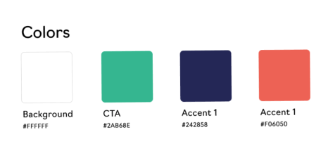
We believe Pepsi to be blue because Coca-Cola is red. As put by Jack Trout, "Differentiate or die."
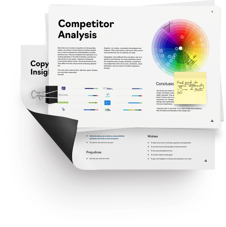
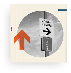
In our research of the competition environment, we focus on two things. First, appearance. Anything that is common among the competitors is taboo for us. We analyze what colors, fonts, graphics, illustrations are used by others and never repeat them. Second, user experience. If there are already some solutions that are widespread and common for the consumer, it's something we can adopt.
In our research of the competition environment, we focus on two things. First, appearance. Anything that is common among the competitors is taboo for us. We analyze what colors, fonts, graphics, illustrations are used by others and never repeat them. Second, user experience. If there are already some solutions that are widespread and common for the consumer, it's something we can adopt.
Сompetitor analysis
12 - 16 hours
Creation of User Flow Map
Time depends on project
A travel without a map is just wandering. Our way is to progress purposefully and logically: we draft the whole algorithm of the product's work. We don't forget any details or features, from email verification to notification preferences.
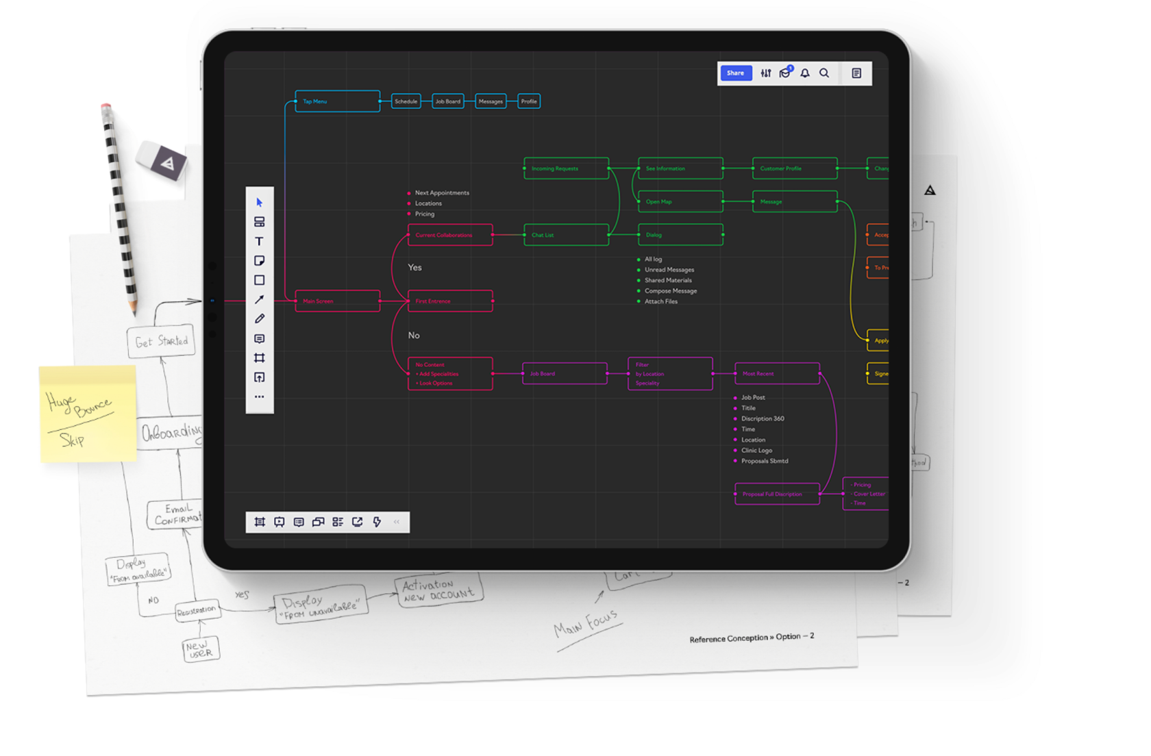
Shift core features closer to user entry points
Deeply understand various scenarios of user interaction with product
Accurately assess the scope of the project
Synchronize functionality
Deeply understand various scenarios of user interaction with product
Accurately assess the scope of the project
Synchronize functionality
•
•
•
•
This approach helps to:
Customer Development
Time depends on project
You wouldn't believe how far off can be assumptions sometimes. For example, one of our clients was certain that his target audience consisted of IPhone users and planned to create an app for AppStore only. However, a quick poll showed 64% of his audience to be Android users. How about that! Makes you wonder, if you too have trusted some theories without checking.
Ideas generation and metaphor creation
8 - 12 hours
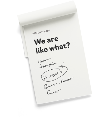
What would you compare your product with to describe it perfectly? Why not use this metaphor as a foundation of the product's style?
An app for taking notes can look like a notebook, an educational project can take after a book, and a financial project can borrow visuals from a credit card. This way user will understand the essence and the use of the product right away. Instead of being unknown and baffling, it becomes something familiar, friendly and intuitive. At the same time, visual style transforms from a mere set of methods into another plane of user experience.



Design Stage
When the goal is set and the creative team is on the same page with the client, it is time to start production.
Wireframes
1 - 2 hours per mobile screen

Building starts with blueprints, web product starts with wireframes. Their purpose is to help arrange features on the screens and think the product through. Since it's still a black-and-white design, wireframes allow quick and low-cost changes without affecting the aesthetics.
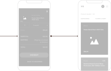
In case of complex digital products or when designing unconventional experience, we create clickable prototypes for usability testing. This way we can see how people interact with our interface and receive the first feedback. It allows us to find and correct mistakes, not waiting for them to become apparent after release.
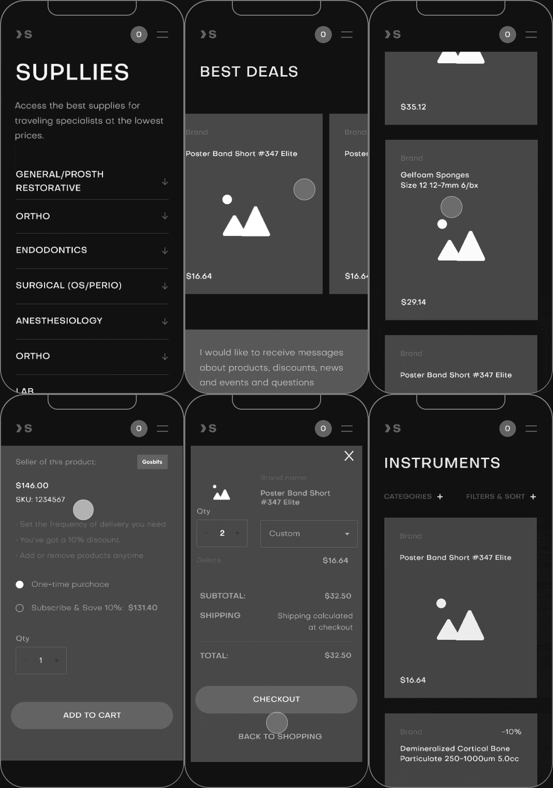
1 - 2 hours per desktop unique information block
UI Concept
56 hours
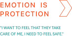
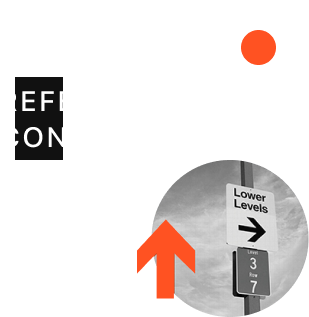
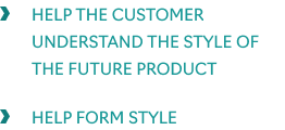
This is the stage when the metaphor takes shape. We already know exactly what we want to get as a result: we know emotion (thanks to moodboard), we decided on tools (thanks to reference concepts), we chose a metaphor, we are confident in functionality (thanks to wireframes). The last missing element is the talent of the creator that will bring it all together. And some coffee... or a lot of it.
We select one (or several) of the most difficult pieces from the project and visualize the UI on them to show what the whole project will look like.

UI Implementation
2 - 2,5 hours per mobile screen
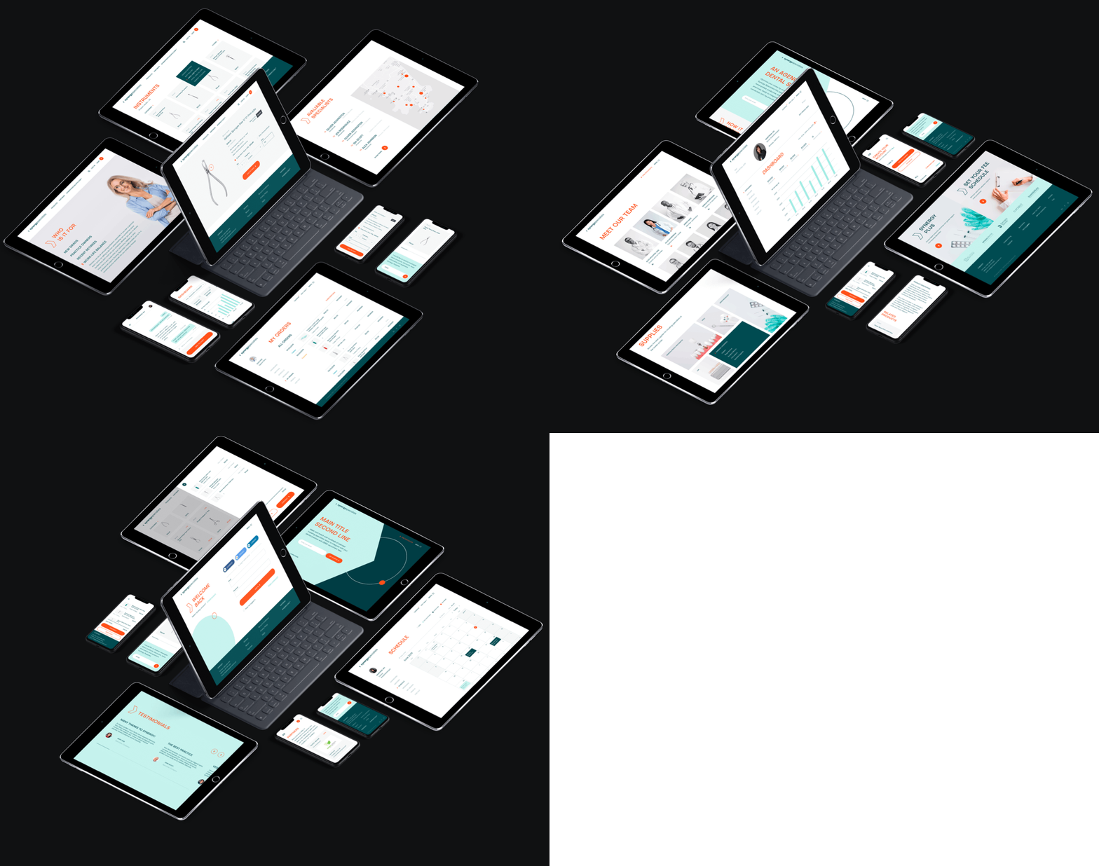
Once we agree on the concept, we will design the rest of the product's screens. Virtually, we take the style formed during the conceptual stage and translate it onto them. In the process, we continue to gradually refine it and form a coherent design system. Time for this stage directly depends on the results of the stage "wireframes".
2 - 2,5 hours per desktop unique information block
Technical Design & Support
Support: 1 - 5 hours on average (depends on project)
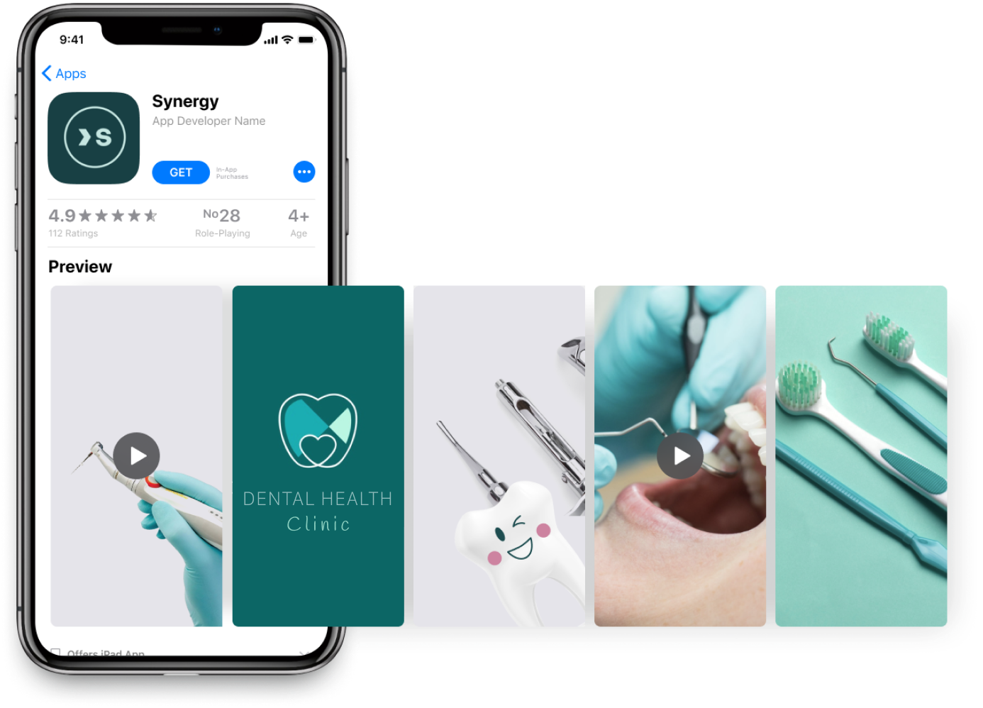
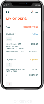
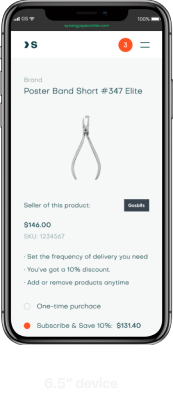
This is stage is about technical work, not creativity. Depending on the project it can consist of responsive design, material preparation, design for AppStore / Playmarket, etc.
When working with complex products, we gradually refine them in cooperation with the client and development team, prepare additional materials, and so on. Our goal is to not only create product design, but also make sure it is fully functional, ready to be enhanced and to grow in a way we imagined together.
UI Kit creation: 12 - 16 hours on average
Remember that satisfaction, which comes with high quality, lasts longer then joy of finding a low price service. If you feel it's your kind of a deal, don't hesitate to contact us
Outro
Get a Design Consultation
Tell us everything
Poland
Ukraine
Katowice,
Armii Krajowej St., 322
Armii Krajowej St., 322
Kyiv,
Goncharnaya St., 9a
Goncharnaya St., 9a
Call Us
Call Us


USA
New York,
287 Park Avenue South
287 Park Avenue South
Call Us
E-mail


