


Kritika
Function
Location
Date
Client
Service for checking code, searching for errors and vulnerabilities
Intro
Tallinn, Estonia
February 2019
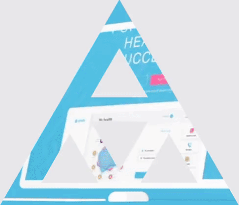
Services
Brand platform
Visual identity
Main task
Our task was to develop visual identity for "Kritika" which is a software product that helps users find mistakes and vulnerabilities in the code written by a software development team.

Logo and tagline

Research
During the client briefing we outlined the mission of Kritika, its competitive advantages, and core customers. The service was developed for CTOs in large companies who want to control the quality of their product but cannot check every single employee.
Kritika does this job for them in a reliable and automatic way. Users who apply Kritika in their work can rest assured that everything is under control. They feel that they are not
Kritika does this job for them in a reliable and automatic way. Users who apply Kritika in their work can rest assured that everything is under control. They feel that they are not
alone and there is something at hand that insures them against mistakes.
Having analyzed the graphics of their competitors, we realized that the majority of similar apps look very much alike. They all appear in a way too "digital", cold, and they don't seem to have a "soul". That's why we decided to emphasize the emotion of using the product with the help of craft stylistics.
Having analyzed the graphics of their competitors, we realized that the majority of similar apps look very much alike. They all appear in a way too "digital", cold, and they don't seem to have a "soul". That's why we decided to emphasize the emotion of using the product with the help of craft stylistics.
Research
During the client briefing we outlined the mission of Kritika, its competitive advantages, and core customers. The service was developed for CTOs in large companies who want to control the quality of their product but cannot check every single employee.
Kritika does this job for them in a reliable and automatic way. Users who apply Kritika in their work can rest assured that everything is under control. They feel that
Kritika does this job for them in a reliable and automatic way. Users who apply Kritika in their work can rest assured that everything is under control. They feel that
they are not alone and there is something at hand that insures them against mistakes.
Having analyzed the graphics of their competitors, we realized that the majority of similar apps look very much alike. They all appear in a way too "digital", cold, and they don't seem to have a "soul". That's why we decided to emphasize the emotion of using the product with the help of craft stylistics.
Having analyzed the graphics of their competitors, we realized that the majority of similar apps look very much alike. They all appear in a way too "digital", cold, and they don't seem to have a "soul". That's why we decided to emphasize the emotion of using the product with the help of craft stylistics.
Research
During the client briefing we outlined the mission of Kritika, its competitive advantages, and core customers. The service was developed for CTOs in large companies who want to control the quality of their product but cannot check every single employee.
Kritika does this job for them in a reliable and automatic way. Users who apply Kritika in their work can rest assured that everything is under control. They feel that they are not alone and there is something at hand that insures them against mistakes.
Having analyzed the graphics of their competitors, we realized that the majority of similar apps look very much alike. They all appear in a way too "digital", cold, and they don't seem to have a "soul". That's why we decided to emphasize the emotion of using the product with the help of craft stylistics.
Concept
As we were looking for a visual image, we decided to create a virtual character and animate the product in this way. Kritika is metaphorically represented as a competent "personal assistant". She knows the topic very well, has her own opinion, and shows creativity. She is learning all the time by studying new languages and has the same goal as the user, i.e. to improve the quality of the product. That's why her criticism is constructive and friendly. Kritika spots minute imperfections and gives useful advice.
Metaphor
Personal assistant
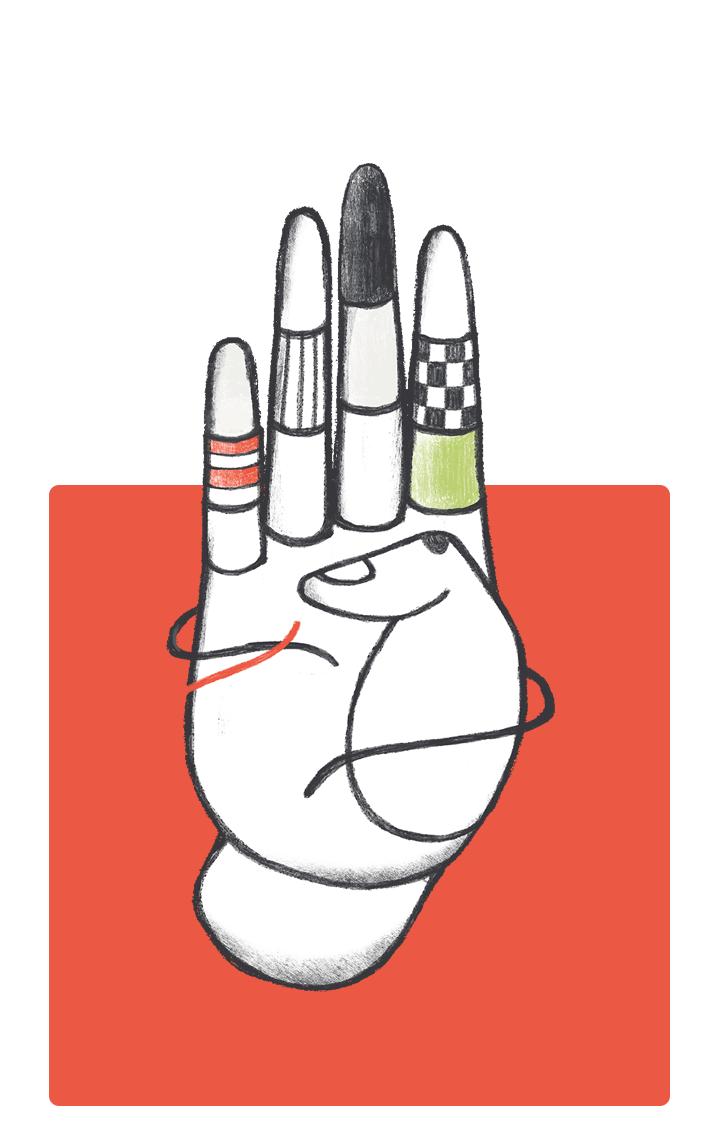
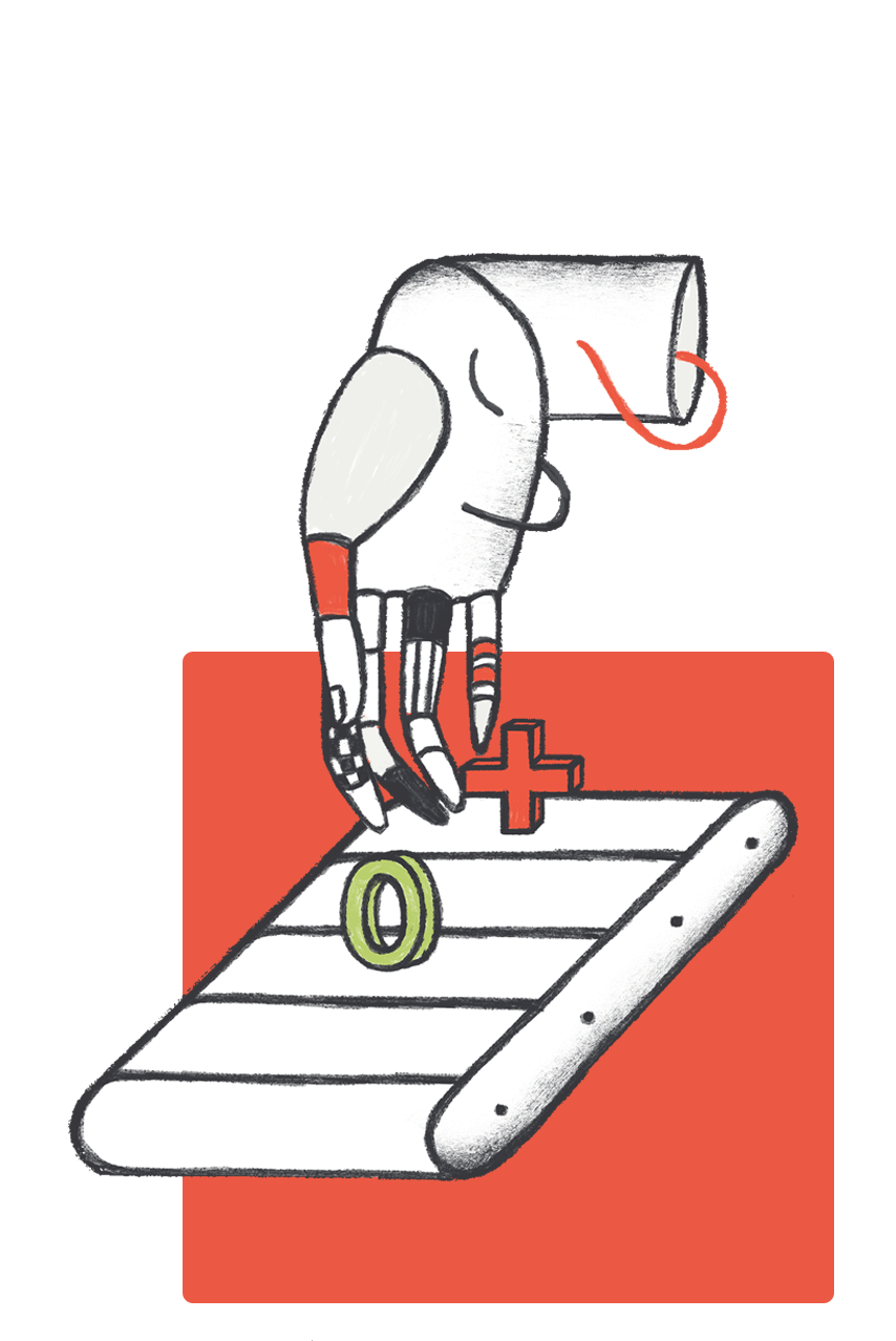
Illustrations

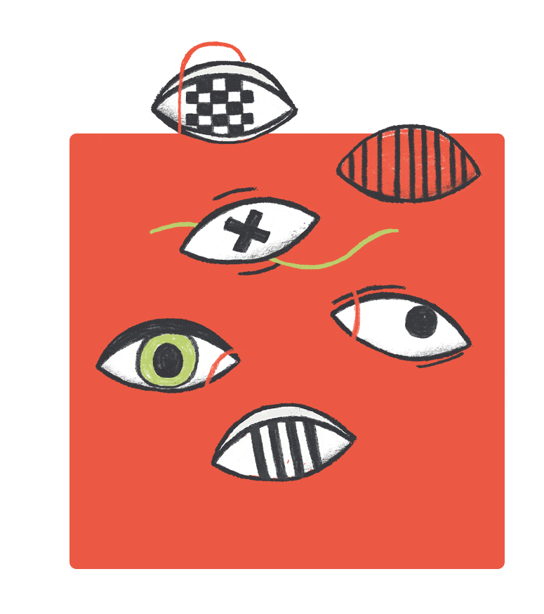
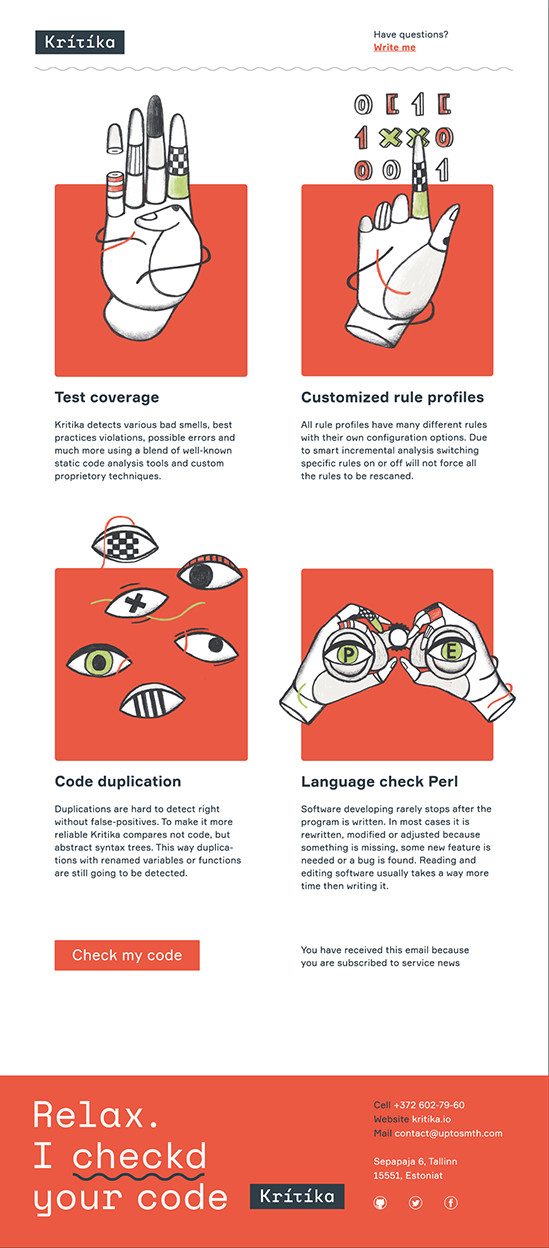
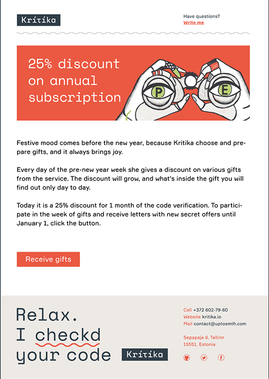
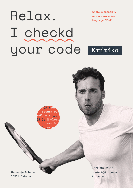
To check the code, "Kritika" only needs eyes to read it and hands to make corrections.
Language support Perl
Test coverage
Code review
Library dependency analysis

Duplications

Customized rule profiles
Solution
The logo is based on the mono-spaced font which taps two different sources. On the one hand, this sort of font is used in code editors, which is the direct field of product application. On the other hand, this is the font of typewriters, and the latter has always been a stereotypic attribute of critics and personal assistants. All this together expresses the metaphoric character in a wonderful way.
The visual image of Kritika is also expressed with the help of craft illustrations. They show
The visual image of Kritika is also expressed with the help of craft illustrations. They show
the way Kritika works and emphasize its functional features. To check and correct the code, the service only needs a pair of eyes and hands, so they appear on the illustrations.
As for the colors of corporate identity, we also chose those that are closer to the real world and are not typical of a digital product, such as natural carrot-like orange and olive colors, deep graphite, and Swiss white, which is the color of paper.
As for the colors of corporate identity, we also chose those that are closer to the real world and are not typical of a digital product, such as natural carrot-like orange and olive colors, deep graphite, and Swiss white, which is the color of paper.
Solution
The logo is based on the mono-spaced font which taps two different sources. On the one hand, this sort of font is used in code editors, which is the direct field of product application. On the other hand, this is the font of typewriters, and the latter has always been a stereotypic attribute of critics and personal assistants. All this together expresses the metaphoric character in a wonderful way.
The visual image of Kritika is also expressed with the help of craft illustrations. They show the way Kritika
The visual image of Kritika is also expressed with the help of craft illustrations. They show the way Kritika
works and emphasize its functional features. To check and correct the code, the service only needs a pair of eyes and hands, so they appear on the illustrations.
As for the colors of corporate identity, we also chose those that are closer to the real world and are not typical of a digital product, such as natural carrot-like orange and olive colors, deep graphite, and Swiss white, which is the color of paper.
As for the colors of corporate identity, we also chose those that are closer to the real world and are not typical of a digital product, such as natural carrot-like orange and olive colors, deep graphite, and Swiss white, which is the color of paper.
Solution
The logo is based on the mono-spaced font which taps two different sources. On the one hand, this sort of font is used in code editors, which is the direct field of product application. On the other hand, this is the font of typewriters, and the latter has always been a stereotypic attribute of critics and personal assistants. All this together expresses the metaphoric character in a wonderful way.
The visual image of Kritika is also expressed with the help of craft illustrations. They show the way Kritika works and emphasize its functional features. To check and correct the code, the service only needs a pair of eyes and hands, so they appear on the illustrations.
As for the colors of corporate identity, we also chose those that are closer to the real world and are not typical of a digital product, such as natural carrot-like orange and olive colors, deep graphite, and Swiss white, which is the color of paper.
Colors
Carrot orange
Pantone 171 C
27%
CMYK 0 75 75 0
RGB 235 89 66
#eb5942
Swiss white
Pantone Cool Gray 1 CP
27%
CMYK 4 2 4 8
RGB 237 234 230
#edeae6
White
Pantone Bright White
18%
CMYK 0 0 0 0
RGB 255 255 255
#ffffff
Deep graphite
Pantone 432 C
18%
CMYK 79 61 49 50
RGB 50 62 72
#323e48
Olive green
Pantone 365 C
10%
CMYK 32 0 58 0
RGB 192 223 136
##c0df88

Monospaced font combines the attribute of critics the typewriter and the attribute of programmers the code editor.

Details
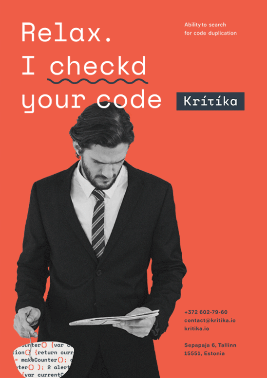
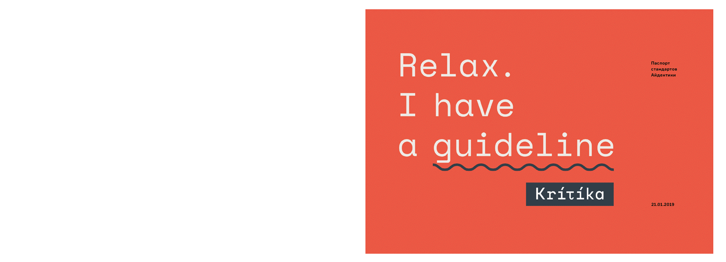
The visual concept is revealed in the details of corporate identity. For example, we made some mistakes in the headlines and underlined them with a squiggly line. This is exactly how mistakes are marked in code editors. Placed under the slogan, the logo resembles a popup message. All the microcopy addresses the user from the first person singular in order to create a feeling of a dialogue.
E-mail


Posters
Conclusion
The metaphor of a "personal assistant" helped us to add some character to the service. The latter is also supported by the illustrations and the microcopy. All this creates scalable corporate identity that stands out among the competitors and can be easily remembered.
Guideline

Credits
Aleksandr Gusakov
Art Direction:
Julia Zamiatina
Graphic Design:
Myroslava Shevchenko
Illustrations:
Akim Karpach
Photography:
Get a Design Consultation
Tell us everything
Poland
Ukraine
Katowice,
Armii Krajowej St., 322
Armii Krajowej St., 322
Kyiv,
Goncharnaya St., 9a
Goncharnaya St., 9a
Call Us
Call Us

USA
New York,
287 Park Avenue South
287 Park Avenue South
Call Us
E-mail

Tell us everything


