


Geo Protocol
Function
Location
Date
Client
Technology startup with an ambitious mission
to create the future.
to create the future.
Intro
Kyiv, Ukraine
April 2019
Services
Brand Identity
UI/UX design
Client
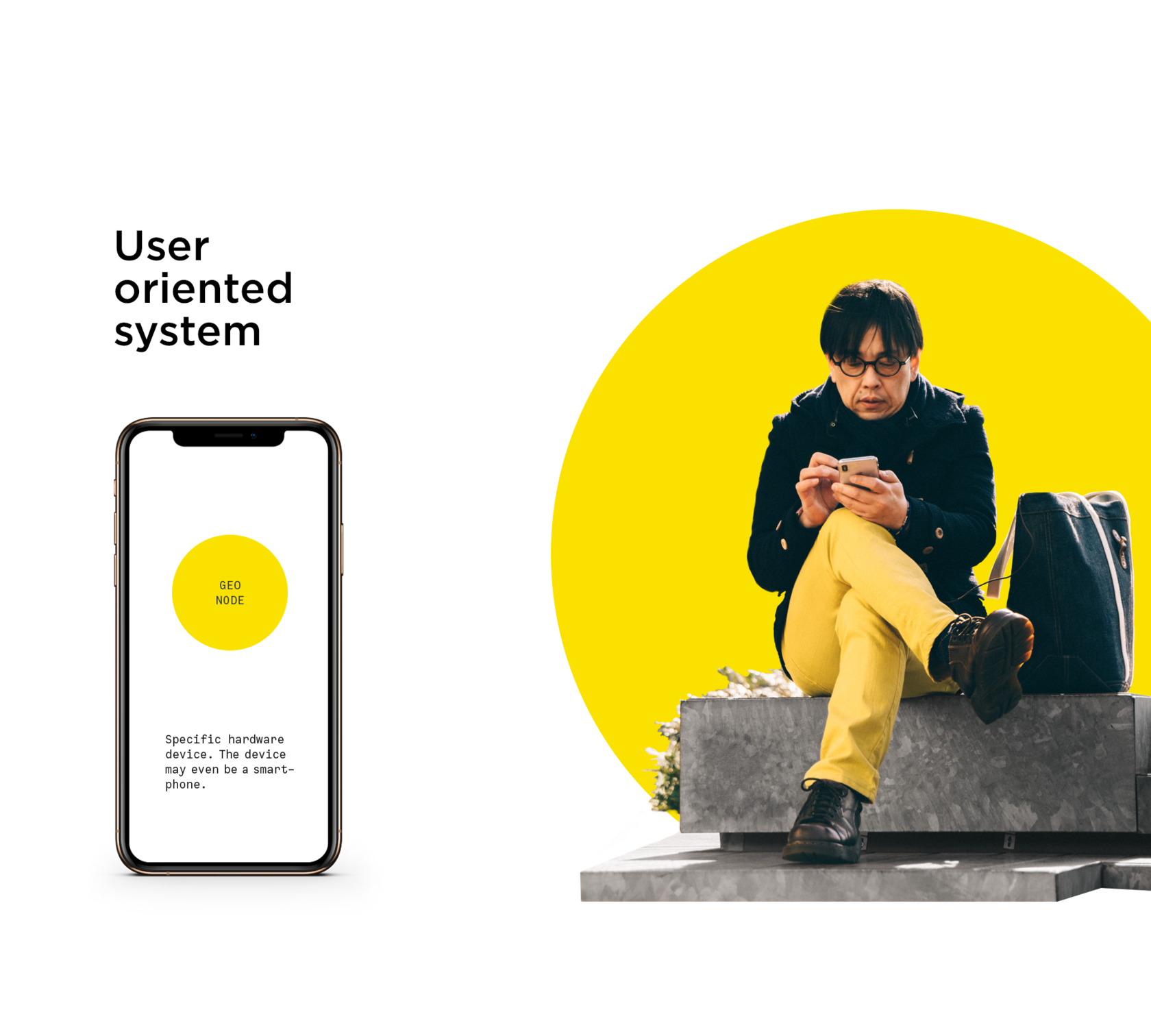
Geo Protocol is a technology startup with an ambitious mission to create the future. The technical protocol is designed to allow people to exchange any values in real time. Euro is for cryptocurrency, cryptocurrency is for real estate, and so with any other assets. The technology is based on blockchain and can be used by other projects to spread the free values exchange idea.
Goals
Using graphics to convey the principle of the protocol. Differentiate startup from dummy projects that disappointed investors. Visual means to convey the product benefits.
Task
One of identity development's main objectives was to get the first round of investment for further product improvement and its commercialization. With the identity and website, the team had to go to several conferences to meet with potential investors.


Concept
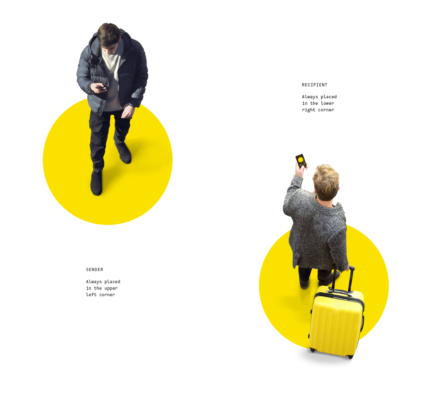
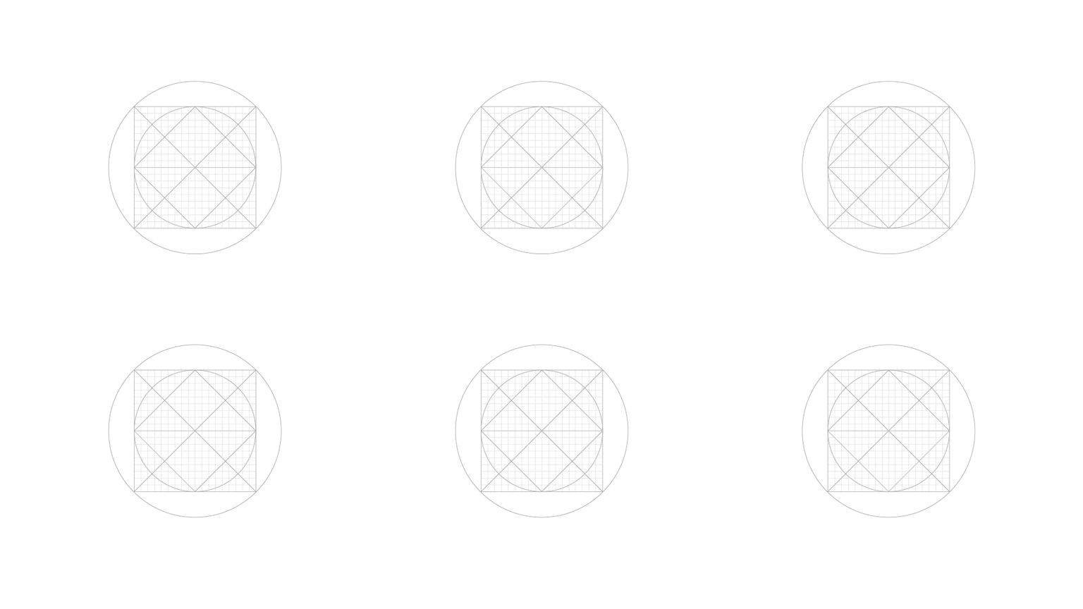
The project's main strategic decision was the transition from a general plan to a large scale. We stopped considering our product as a way to unite abstract humanity and concentrated on the assets exchange between two people. It was as if we looked through a microscope in order to understand and then explain how the protocol works. This vision of the world is fully consistent with our brand's archetype, the main desire of which is to learn the fundamental laws. Our audience seeks to gather as much information as possible, systematize it and use it to achieve their goals. We helped them with this task by closely showing our work's essence. In order to reflect the idea, we use the metaphor "The field of play (pay)".
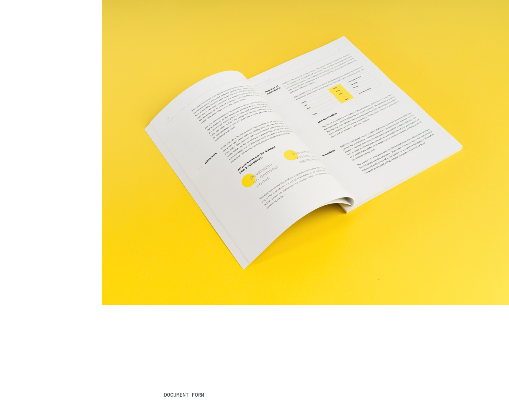
Register
of equivalents
of equivalents
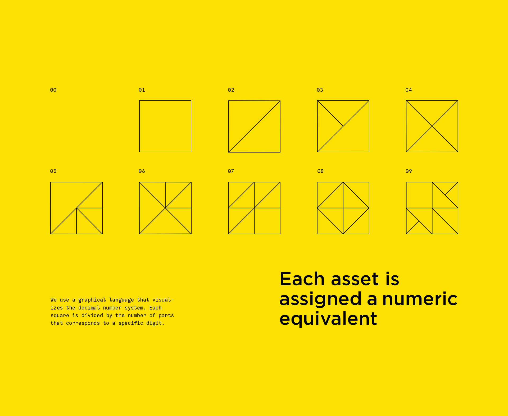
Thanks to the register of equivalents, the Geo Protocol system has the ability to create the equivalent of any asset for the free exchange between protocol participants. Equivalents is the context in which the relationship between two nodes is expressed. Equivalent can be anything: USD, BTC, kW of energy, time, etc. Each equivalent is assigned a numeric name.
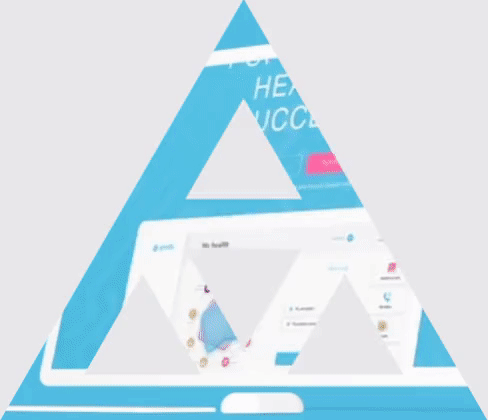
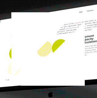
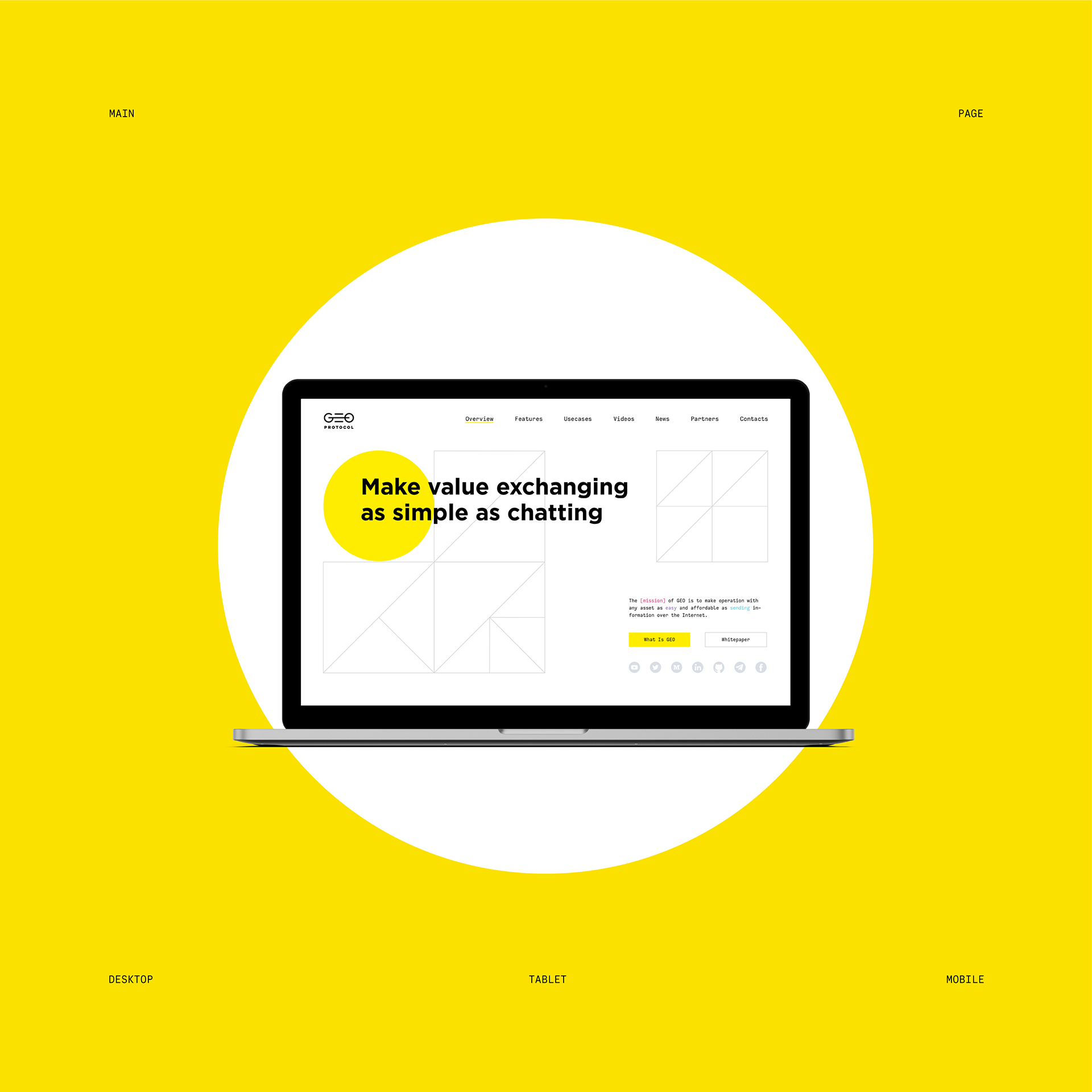
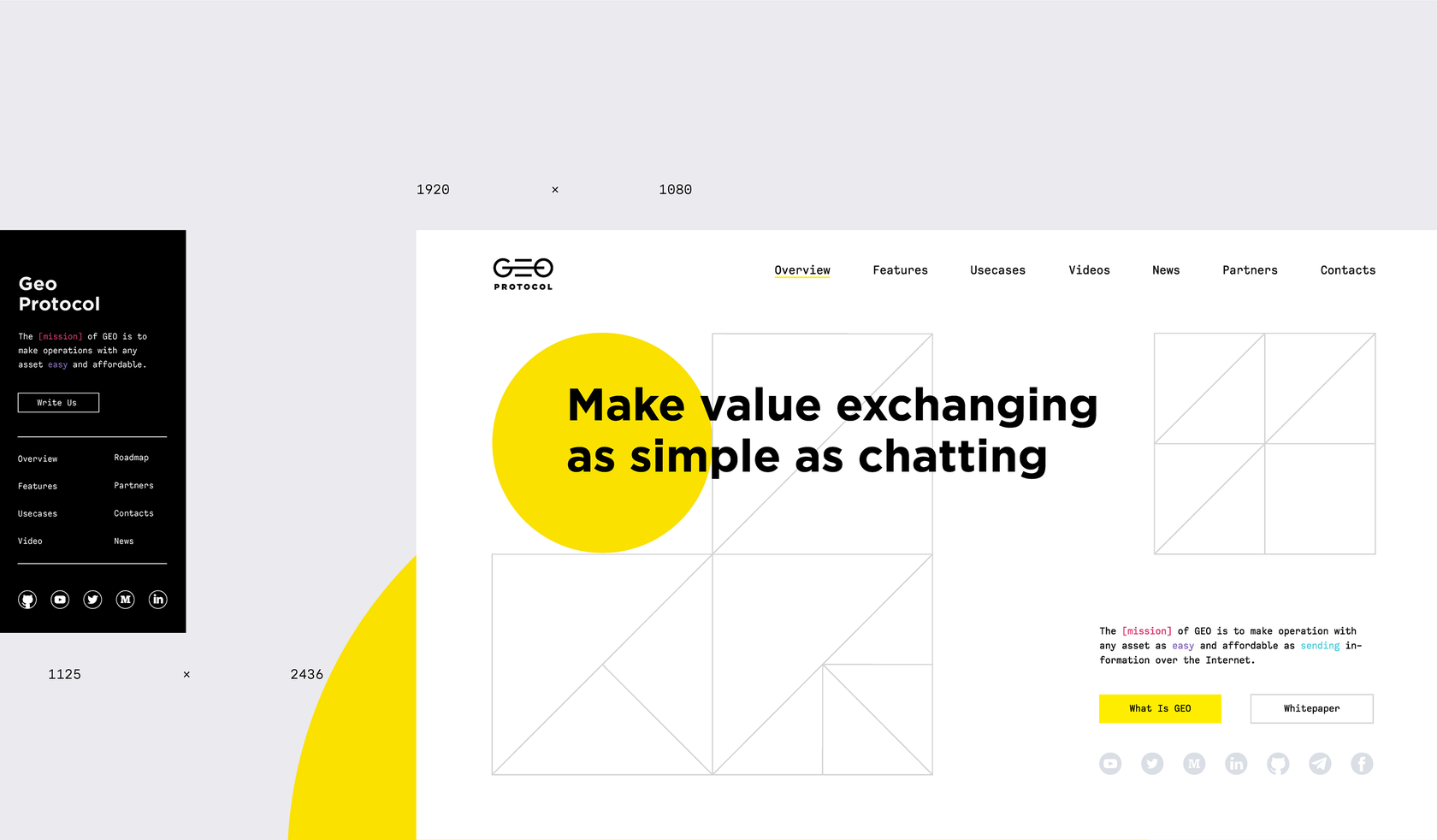
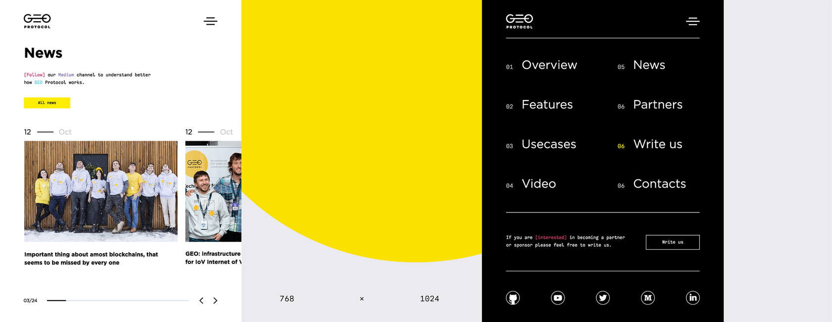
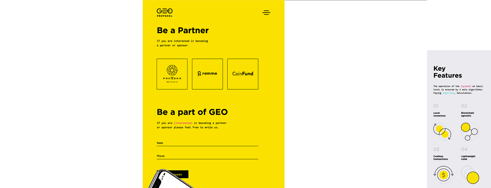
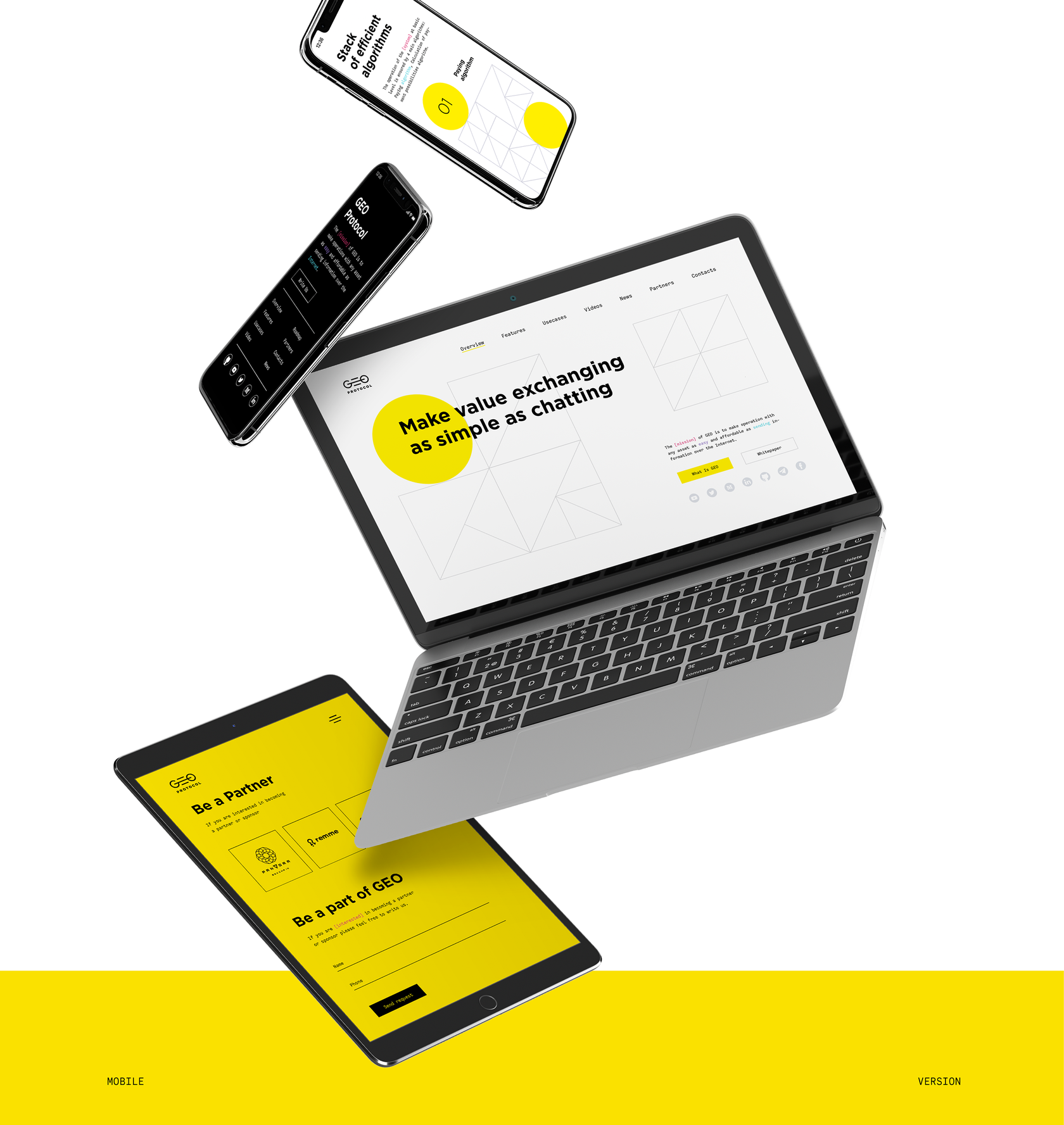
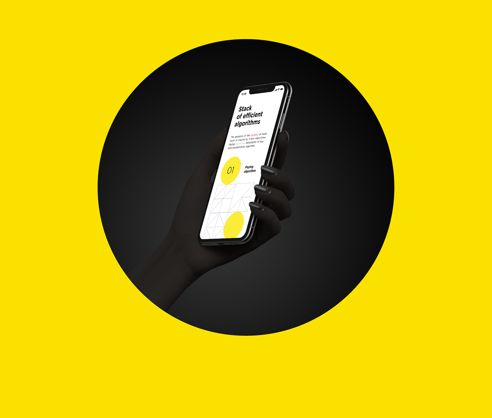
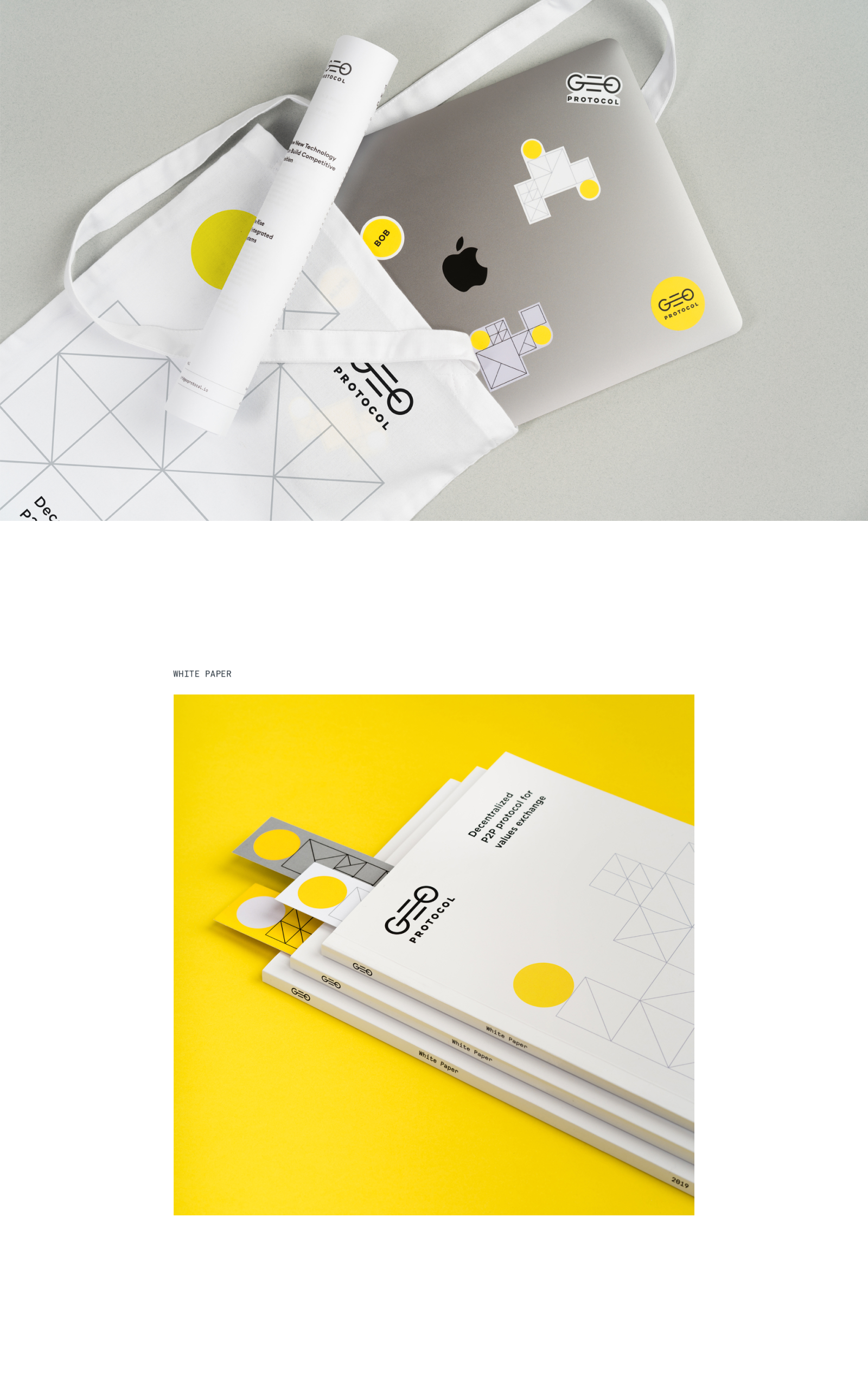
Website
After the identity approval we had to design the website. The startup team was going to the conference to present the project to investors. At the conference, the client planned to show the website in person to potential partners and in a couple of minutes to explain the essence of his project. Based on the task, we built the logic of history on the website, explaining the protocol capabilities and how it works. Content dictated the layout features, and corporate identity helped to highlight and visualize information.
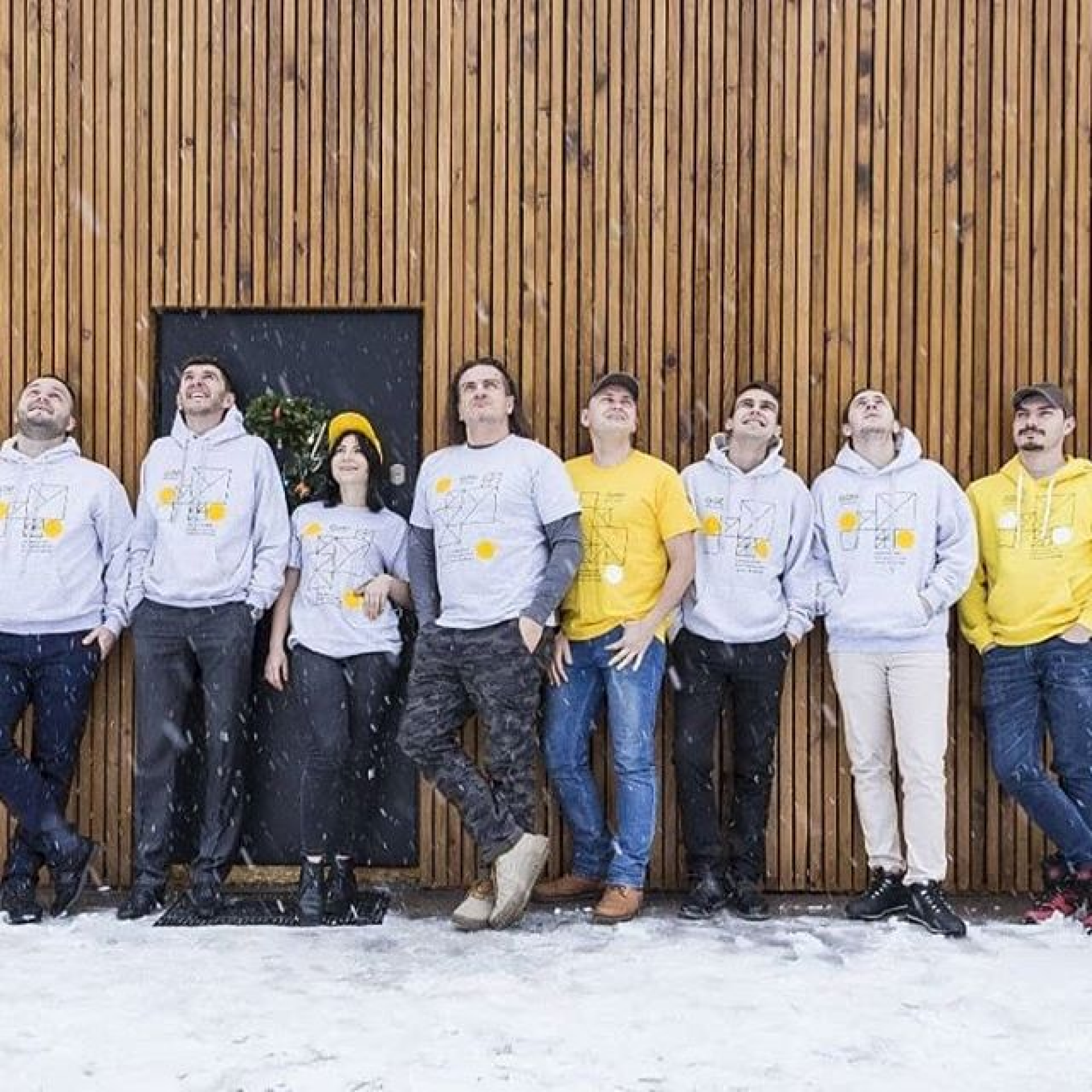
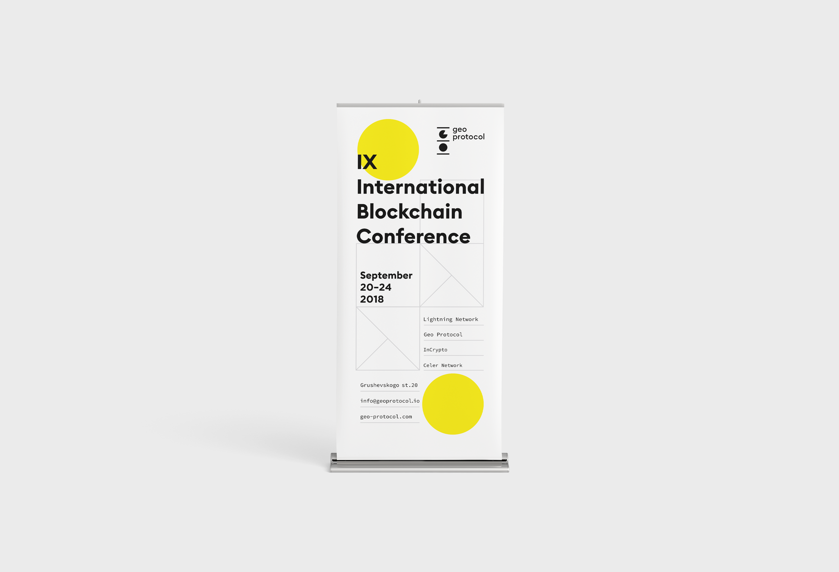
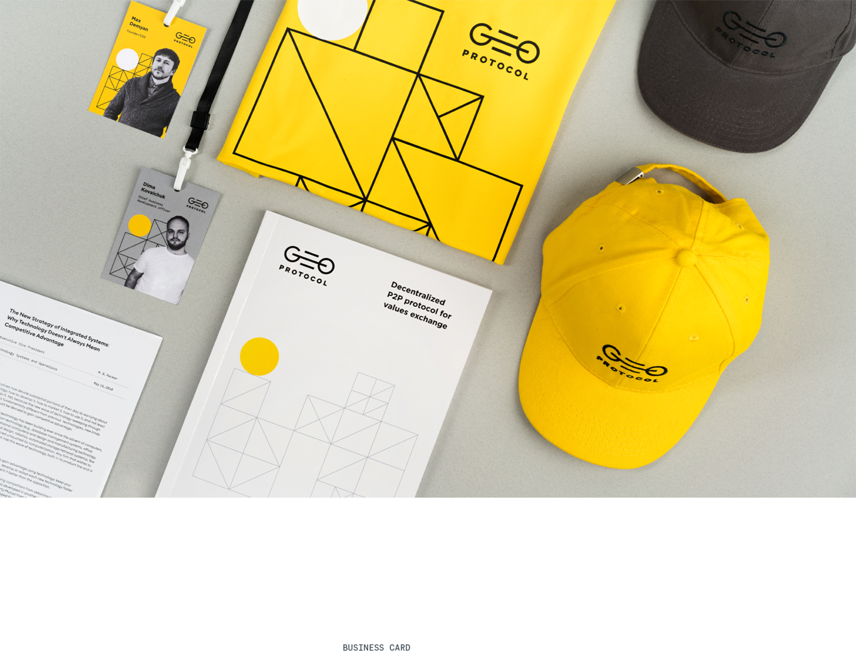
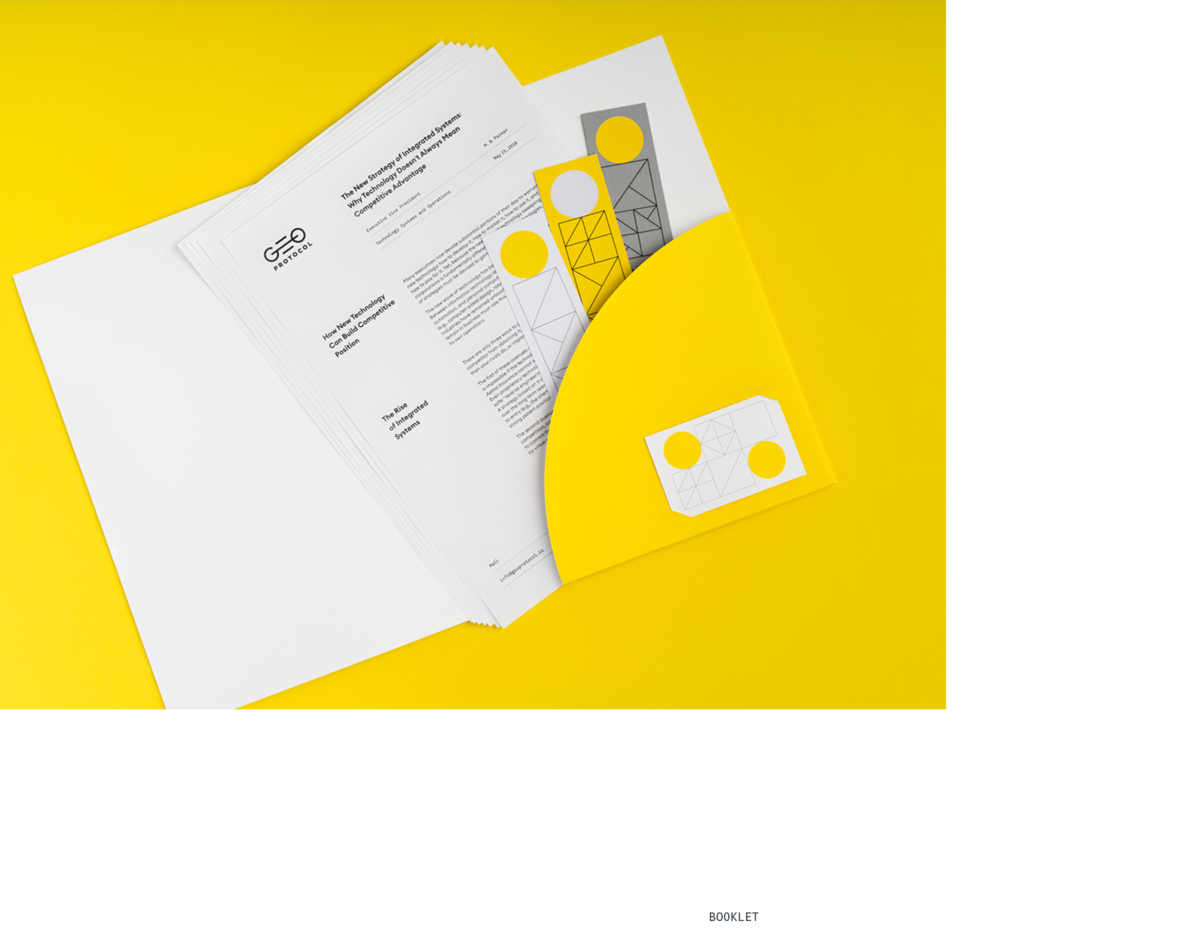
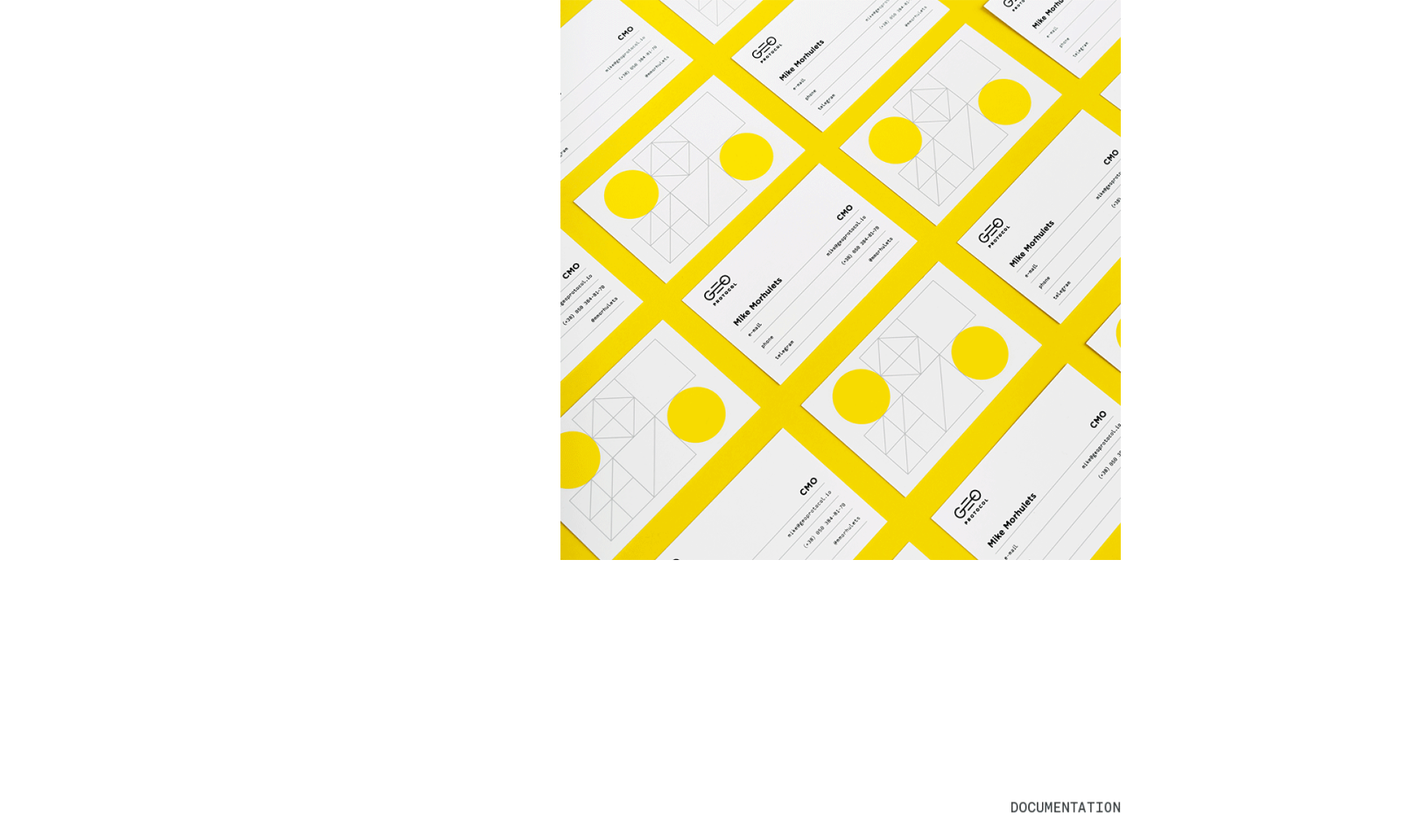
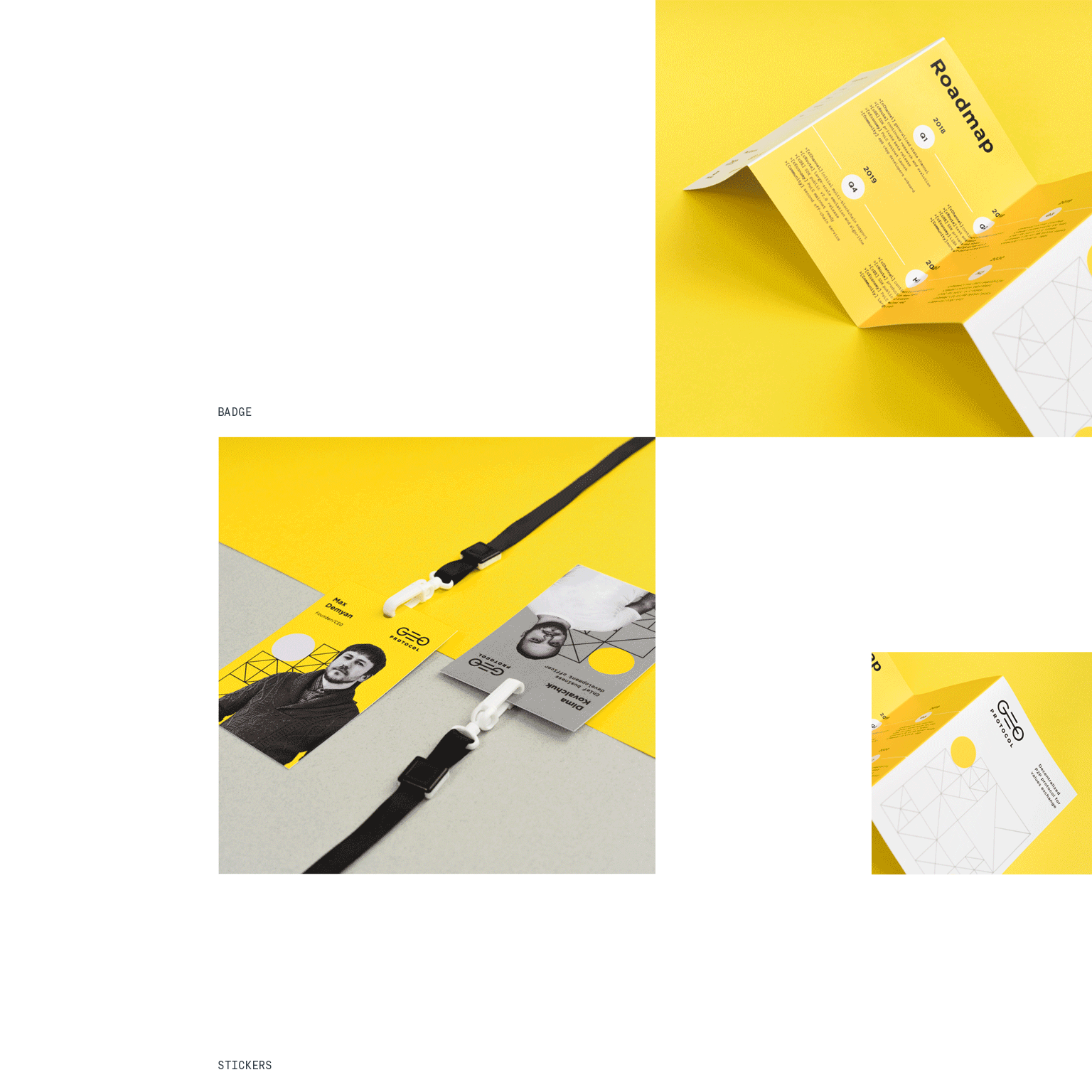
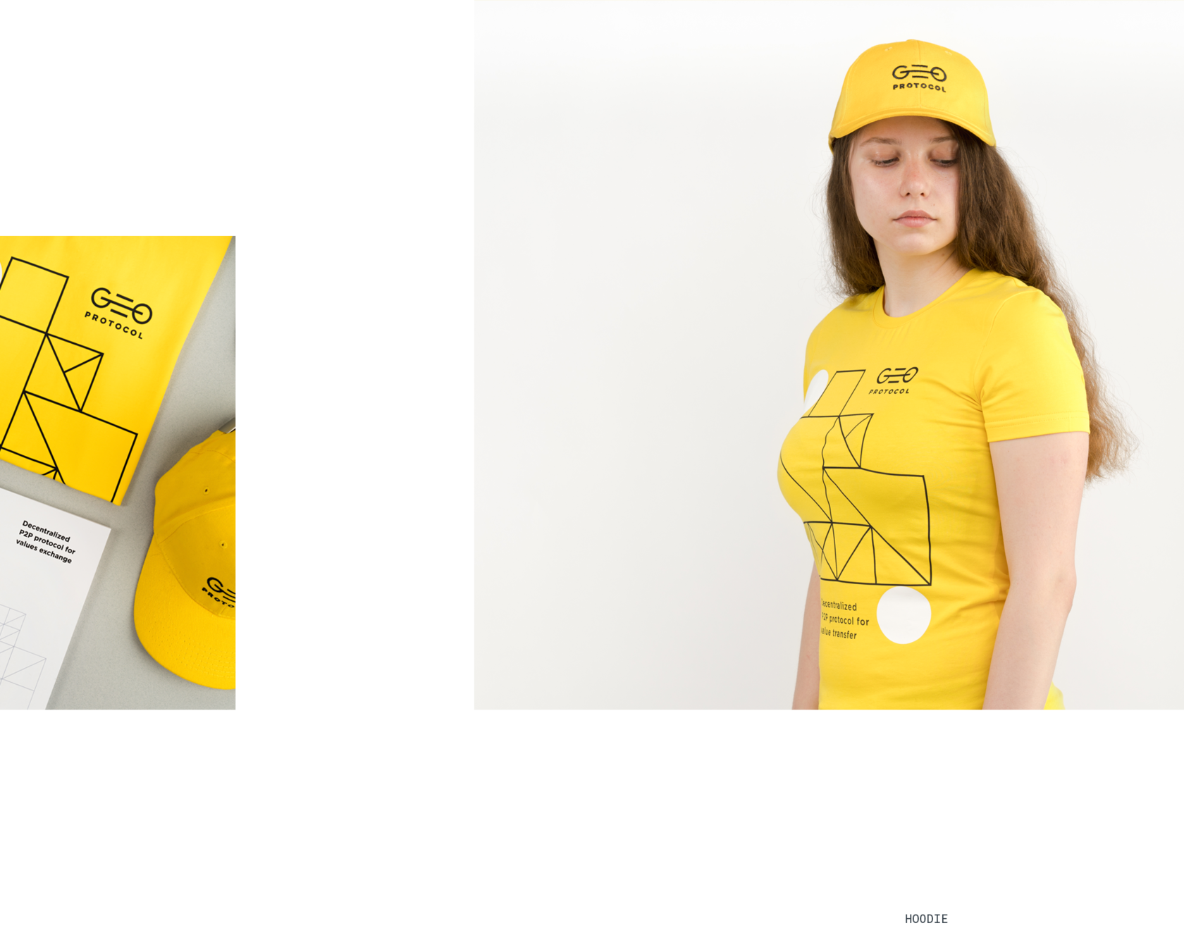
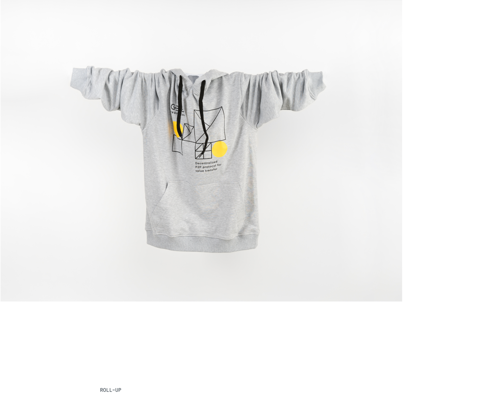
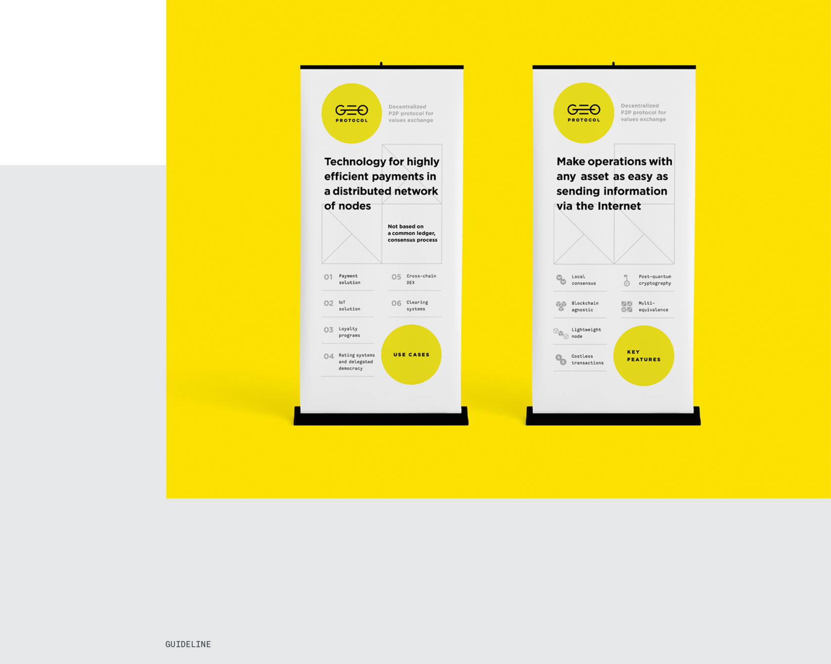
Corporate carriers
After the logo and corporate graphics approval, we developed them on media and described in detail in the guideline how to work with each of the visual elements correctly. Most carriers are merch for conferences. Since the team consists of many people, it was important to emphasize the uniqueness of each, but at the same time leave general recognition. We used different combinations of corporate colors and graphics dynamics to convey this.
Awards:
Best Circle Logo Designs
by DesignRush
by DesignRush
Thank you
for watching
for watching
Art Direction
Aleksandr Gusakov
Mike Samovarov
Alexander Masliy
Julia Zamiatina
UI/UX
Graphic designer
Get a Design Consultation
Tell us everything
Poland
Ukraine
Katowice,
Armii Krajowej St., 322
Armii Krajowej St., 322
Kyiv,
Goncharnaya St., 9a
Goncharnaya St., 9a
Call Us
Call Us

USA
New York,
287 Park Avenue South
287 Park Avenue South
Call Us
E-mail

Tell us everything


