

Bilskiy Community — Brand Identity
Bilskiy Community is a personal development ecosystem built around transformation, self-discovery, and personal growth. With 11 years of experience and more than 52,000 clients, the brand helps people understand themselves, break limiting patterns, and build a life based on self-love, ambition, and personal strength.
The challenge was to translate this transformation into a distinctive identity that could position Bilskiy Community as more than an educational product — as a complete environment for personal change.
Create a recognizable identity that reflects Bilskiy Community’s transformational approach and positions the brand as an experienced, ambitious mentor rather than conventional self-help. Build a flexible visual system capable of connecting the community, educational programs, digital platforms, content, and learning materials under one coherent brand while making the idea of personal transformation immediately visible.
The identity is built around the metaphor of star formation.
A star begins as matter hidden in darkness. Under pressure and energy, it gradually forms a core, ignites, and eventually becomes a source of light capable of shaping an entire system around itself. We used this process as a metaphor for personal transformation: Bilskiy Community helps people move through internal change, discover their authentic core, and develop the strength to shape their own lives.
The result is a visual language where light represents personal power, the center represents the self, and expansion represents transformation and influence.

The core graphic device is built around a central point from which lines expand outward. It visualizes the moment when internal energy becomes visible — echoing both the formation of a star and the transformation of a person.
By changing the density, scale, direction, and intensity of these lines, the system can move from subtle backgrounds to highly expressive compositions while remaining instantly recognizable across the entire brand.
Deep black creates the visual foundation of the identity, representing the space from which transformation begins. Rich green introduces energy, growth, and life, becoming the brand’s primary signal of change, while white creates moments of clarity and illumination.
The high-contrast palette allows the brand to shift naturally between immersive dark digital environments and clean educational materials without losing its character.
The typography combines Upmax and Cera Pro to balance personality with clarity. Upmax is used for headlines and supporting labels, giving the identity a distinctive, confident voice that reinforces Bilskiy Community’s transformational character. Cera Pro, carried over from the previous identity, is used for body copy — preserving brand continuity while providing high readability across educational materials, digital platforms, and long-form content.
Together, the two families create a flexible hierarchy that allows the identity to remain expressive in communication and highly functional where information and learning come first.

The icon system reduces the idea of transformation to a series of simple geometric symbols. Star-like forms evolve from compact points of light into larger, more complex structures, creating a visual progression from potential to realization.
Their minimal construction allows them to function as both practical interface elements and recognizable brand assets across digital products, educational materials, and communication.

Photography places the individual at the center of the transformation. Portraits are framed through circular and layered forms inspired by celestial bodies and orbital systems, visually reinforcing the idea that change begins with the person.
Rather than treating photography as a separate element, the graphic system interacts with each portrait — making every person feel like the center of their own evolving system.
The website turns the identity into an immersive digital environment. Radiating lines create depth and movement around key messages, directing attention toward the center while supporting the core metaphor of transformation from within.
The restrained typography and dark interface keep the experience focused, allowing the visual system to create emotional impact without competing with the program itself.


The YouTube system translates Bilskiy Community into a content-first environment where recognition has to happen instantly. Consistent framing, typography, portrait treatment, and green graphic elements connect interviews, educational videos, and conversations into one recognizable content ecosystem.
The result strengthens Pavel Bilskiy’s personal presence while keeping every piece of content clearly connected to the wider Bilskiy Community brand.


The visual identity extends into the slides used during Bilskiy Community’s online lessons and YouTube sessions. The branded presentation system combines clear information hierarchy with recognizable typography, green accents, icons, and graphic elements, helping structure key ideas while keeping the focus on the speaker and educational content.
This creates a consistent learning experience where every presentation feels unmistakably Bilskiy Community and connects the educational content with the wider brand ecosystem.

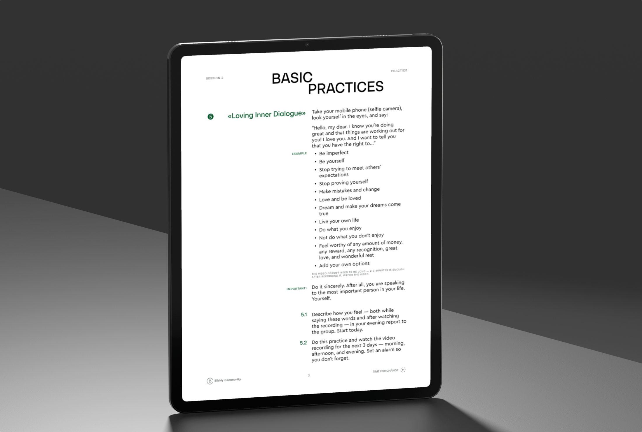
The identity extends across the materials created for different topics within the SelfMade Man methodology. Each cover follows a consistent system of typography, transformation symbols, and radiating graphics, while adapting the content to individual themes such as authenticity and relationships.
This approach makes every material immediately recognizable as part of Bilskiy Community while creating a clear visual connection between different stages and topics of the program.


Case Studies that Drive Results 285 Cases
See how we’ve helped SaaS, fintech, healthcare, and e-commerce brands scale with design that delivers measurable ROI.


Let's Build Something Great Together
Have a challenge or idea worth designing for? We’d love to hear it

What Clients Usually Ask
-
What makes League.Design different from other agencies?
We combine design excellence with business thinking. Our work isn’t just beautiful, it’s strategically crafted to drive growth, improve user experience, and make your brand unforgettable.
-
How do you make sure the design matches our brand and goals?
We dive deep into your company, industry, and audience during discovery. This helps us create a visual language and UX that feels uniquely yours, not a template anyone could use.
-
Can you work with our in-house team?
Absolutely. We often collaborate with internal teams, from marketing and product to developers, to ensure our design integrates seamlessly with your workflow and tech stack.
-
Do you handle development in-house?
Of course. We have a reliable partners, curated by our delivery manager, who work closely with our designers to ensure every project is implemented exactly as envisioned.
-
Do you only work with big companies?
No, we love working with both startups and enterprises. Our process is scalable, so whether you need a fast MVP or a full-scale rebrand, we can adapt to your stage and resources.
-
How do we get started?
Just fill out the short form on our contact page, and our account manager will contact you. We’ll talk through your goals, give you a project outline, and map the next steps to kick things off.

