BRAND IDENTITY
WEB DESIGN
WEB DESIGN
2018
CX DOJO
ABOUT
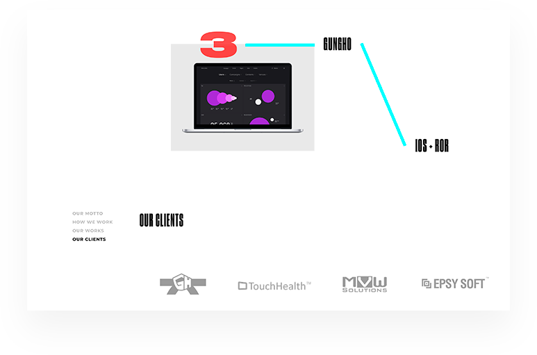
PROJECT
PROJECT

Design and functional brand identity creation for US based IT company with a full software development cycle and customer experience consultancy.
The company name consists of two parts: CX and DOJO. "CX" describes an industry of the company. "DOJO" displays close to the Japanese product development school approach. During company's identity development, we tried to find something in common in these two different areas. And we found it!


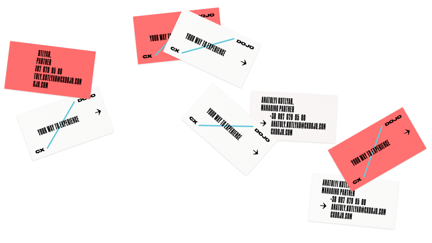
BUSUNESS
CARDS
CARDS

BRAND
ESSENCE
ESSENCE

BRAND
SYSTEM
SYSTEM


BRAND
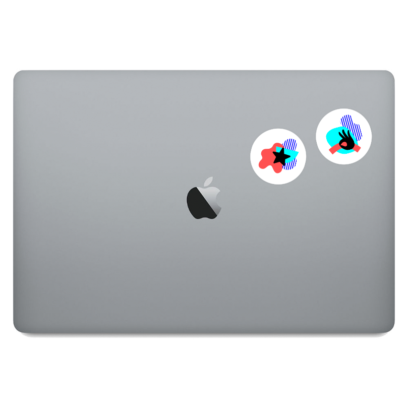
ITEMS
ITEMS

An image of a path formed a basement for a dynamic company's logo. The line connecting two parts of the name, same as a digital products user seeks the shortest way.

The choice of a color wasn't random. Brand colors are inspired by views of Tokyo at night and its neon lights.


BACKGROUND TEXT
GRAPHICS
TEXT
BACKGROUND

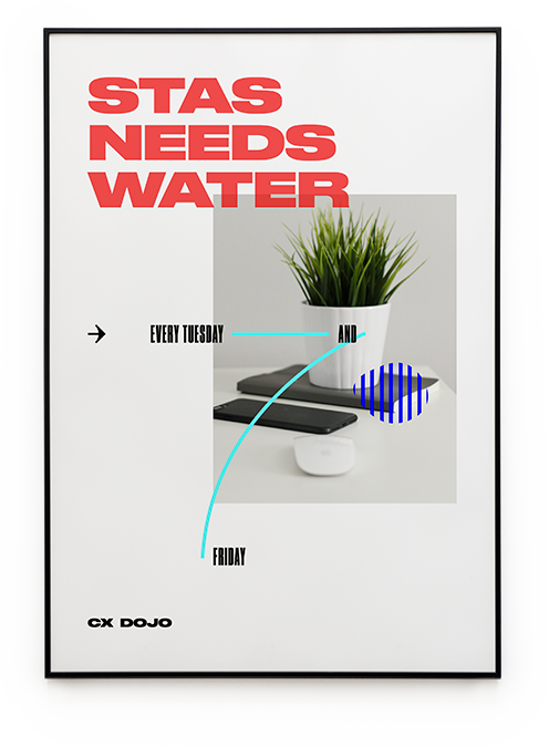
BRAND
ITEMS
ITEMS


BRAND
ITEMS
ITEMS


— WALT DISNEY

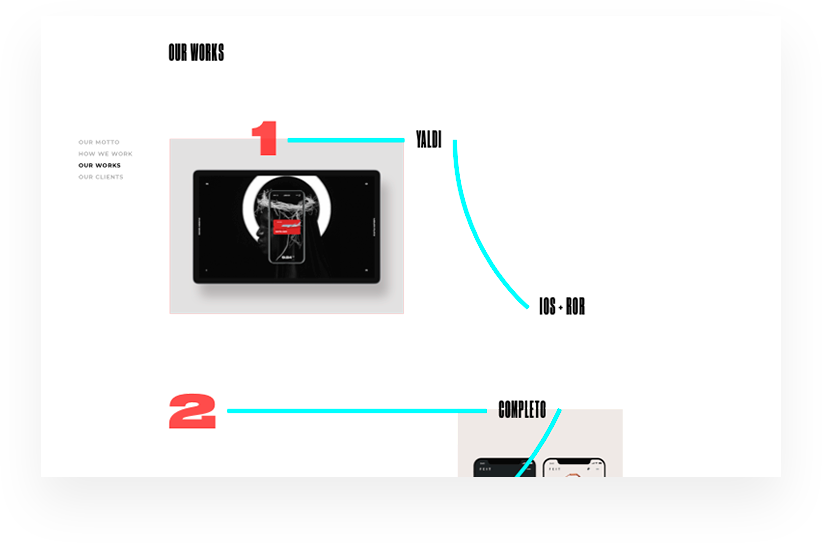
WEB
DESIGN
DESIGN


CX DOJO
2018
CREDITS
KIRA KIEU
ALEXANDER GUSAKOV
JANA AVDIENKO
HELEN MELNYK
DESIGN
ART DIRECTION
SPECIAL THANKS
Got a project?
Tell us everything
Telephone
+380675621337
E-mail
hello@league.design
Address
st. Goncharnaya, 9A
Kiev, Ukraine
Kiev, Ukraine


